interface from the file:
// creates a progress bar of the given ID and returns it
global func CreateProgressBar(
  ID /* ID of the progress bar */
  , int max /* maximum value of the progress bar */
  , int current /* starting value of the progress bar */
  , int time_out /* time in frames after which the progress bar closes itself when not receiving updates, might be nil */
  , int owner /* owner of the progress bar */
  , proplist offset /* proplist {x = ?, y = ?} that specifies the offset of the progress bar relative to the calling object */
  , int visibility /* visibility mask for the progress bar, f.e.: VIS_Owner | VIS_Allies */
  , proplist data /* proplist with extra data that is passed to the progress bar */
  )
plus
SetValue etc.example use (reloading of a weapon):
func FxIsLoadingStart(target, effect, temp, load_time)
{
  if(temp) return;
  effect.max = load_time;
  effect.bar = Contained()->CreateProgressBar(GUI_SimpleProgressBar, load_time, 0, 20, Contained()->GetOwner(), {x = 0, y = -20}, VIS_Owner | VIS_Allies, {width = 20, height = 4});
}

func FxIsLoadingTimer(target, effect, time)
{
  effect.bar->SetValue(time);
  if(time >= effect.max)
  {
    FinishReload();
    Sound("Click");
    return -1;
  }
  return 1;
}
Yes, it's that simple again. I don't even have to remove the bar because of the timeout.
PS: feel free to add own progress bar styles - as long as they adhere to the interface, they are dynamically exchangable!
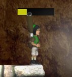
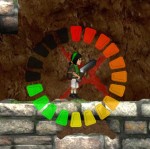
screenshots of the two current bar styles:
GUI_SimpleProgressBar and GUI_RingProgressBar
But I guess at least when reloading, the progress bar could be around your Clonk. And that is possible of course.
So I guess if we know what we want, it could very well be possible:
Brainstorming
When?
- when aiming with the bow to show when the bow is tensed (around the mouse cursor)?
- when reloading with bow and musket (around the Clonk)?
How:
- how "aggressive" should the display be? In Caedes where the screenshots are from, your weapon is the most important thing you should care about. But for the bow and musket I don't think it should be too aggressive.
I could just slap the bar from the screenshot around the Clonk - but I don't think that would fit visually.
- how should the bar look when tensing the bow? It could for example be a target with red rings that become more focused the more you load and turn green on 100%
Other
when we are at it: Where else? Charging of the Jar of Winds? Producing stuff? Do we have placeholder numbers left anywhere? (Message("%d", iProcess))
> Do we have placeholder numbers left anywhere? (Message("%d", iProcess))
\Objects.ocd\Icons.ocd\Number.ocd
Any left, because messages bad?
The objects do not actually have to have the correct position, they should just be drawn where the mouse is (like x-coordinate -200 currently means "offset from right screen border")
I think that should be less work than actually modifying the mouse cursor graphics?
But it is true that currently the display is too small. Also for the health bar - I think we really need a bigger display of that sooner or later now that the backpack is gone.
Small arrows that go from black+transparent to bright when loading. Subtle yet well noticable if you want to pay attention to them.
I could imagine that they are not too annoying :)
- using in-game objects (here the arrow) in HUD elements conveys that there is a direct connection to it. However, this would only be true for the bow. Even there, I'm only reloading one arrow, so the number of arrows is misleading.
- using in-game graphics (again the arrow) is visually confusing. This could as well be some "ring of arrows magical shield spell" for all I can read from it, where the arrows are actual arrows. I might even confuse them in a heavy bowfight with arrows going everwhere.
- the graphics on its on is problematic. I think it's visually unappealing and will prove difficult to read while moving over varying backgrounds.
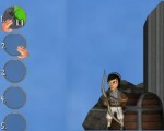
Hm, random thought: Wouldn't it be a better idea in the first place to put the progress bar into the inventory menu? That's where we already show how many arrows are in a bow, unless I'm wrong. Also makes it clearer what item the progress bar belongs to if it should become unclear at some point. WoW-style or something.
Having the bar in the HUD would be counter productive imo
If you make it flashy enough you will be able to read it even without averting your eyes. The right-side design in your original post would have a lot of potential for that, imo.
It's a fine line, really. But once you are trying to make the indicator subtle, that smells for me like it shouldn't be where you put it in the first place. Also "going from black+transparent to bright" sounds like it will always be effectively invisible at some point, depending on the background :)
It's a fine line, really. But once you are trying to make the indicator subtle, that smells for me like it shouldn't be where you put it in the first place. Also "going from black+transparent to bright" sounds like it will always be effectively invisible at some point, depending on the background :)
And it's so subtle that I just comitted it now. Let testing see whether it's useful.
For me it is even on the border to being too small atm - but I had the surprise that elements with the standard HUD category are not zoomed in in the HUD and therefore appear a lot smaller, than I thought they would be :)
My humble idea would be to put the progress bar into the background and make it not a spinning circle, but more of a circle that gets more and more filled out with time. Like you would pour colored water into a fishbowl. This way it would stay in the background, but also use as much space of the item slot as is possible to give information to the player.
>Did you consider this?
No, not yet. I chose the progress bar style that you see there because it already existed :)
I didn't exactly get what you meant there, but my next try would be a pie that starts dark and, like currently, fills clockwise. (that might be what you mean, right?)
That pie would be behind the slot and would completely fill it.
While we are at it:
I thought about making the cirlces non-transparent and instead choose a color that will make it easier to distinguish the items inside. Maybe a very light brown? As I can't see my coal at night for example.
Another idea where I just need someone to tell me that it is a bad one: How about keeping the transparency and instead coloring the background depending on what item we have where i.e. weapons red, defensive blue, tools green, ressources light brown, ... (will post a screenshot if it's not understandable)
I added a GUI_ShadedSimpleProgressBar style which represents the old HP bar (the one Krakatoa uses).
I added a System.ocg/EnergyBar.c which provides
global func AddEnergyBar() to add one for any object (structure/living). I also added Rule_EnergyBarsAboveBuildings and made Krakatoa use that.Just for consistency (with the progress bar interface it doesn't need another object and we already had the EnergyBar.ocd twice (Tutorial04 and Krakatoa)).
Change the HUD energy bars (below the Clonk portraits) to use the progress-bars-stuff?
> I added a System.ocg/EnergyBar.c which provides global func AddEnergyBar() to add one for any object (structure/living).
I think that should be inside the progress bar definition, so scenarios which don't want to use any of Objects.ocd (total conversions) aren't required to provide dummy definitions for stuff referenced by System.ocg (which you can't disable/override).
But per se it has nothing to do with any of the existing objects. So I would put it into a System.ocg folder inside of ProgressBars.ocd. Does that work?
PS: to elaborate, there are progress bar styles but the style has nothing to do with the functionality (showing hp)
Powered by mwForum 2.29.7 © 1999-2015 Markus Wichitill


![Germany [de]](/mwf/flags/de.png)


![Ireland [ie]](/mwf/flags/ie.png)

![United Kingdom [gb]](/mwf/flags/gb.png)


