
![[th]](/mwf/flags/th.png "Thailand")
 Hi there, I want to redo the header with navigation in the next days. Before I do this however, I would like to collect some feedback from you:
How would you imagine an improved header navigation?
Current plan
1. Abolish the sub- or deeplinks. The reason is that it is not clear if the top-link is just the drop-down or an actual link and could be easily missed. For Development and Documentation it is actually the most important link because those are the portal pages that themselves also link to those sub-pages. So instead, I want to move those sublinks to more prominent locations on those portal-pages. You already see that in the Downloads page.
For example the C4Script reference will be linked prominently on the documentation page but not appear in the header navigation. The "Development Snapshot" and "Archive" will not be linked in the header anymore as they are advertised on the portal page for Downloads. The top level links should be (in that order)
Home Download Blog Forum League Docs Developers Repository Bugs(I moved Repository and Bugs up because they are just links that are clicked very often by the devs. Otherwise better would be a developers portal page that showed bug updates, newest repository commits, code review updates (crucible) and a prominent link to our github page but I don't think that is doable.)
2. Center the navigation
3. No more highlighting on which top-level page one currently is (=> website loads faster, no more odd display of header while still loading); perhaps via JS
4. Hopefully: new header logo and background. It is time that this one is actually done by an artist, not an administrator
5. I am playing with the idea to display the navigation links as big icons but I have not seen this really except on eclipse.org, so perhaps it is a no-no?
6. Do not use Endeavour.ttf for the links as there continue to be problems with that. (Not worth to maintain)
![[de]](/mwf/flags/de.png "Germany")
 I'd like to see a better navigation concept for the wiki. The wiki is a nice tool for making Design Documents and such but as it is rarely used. There are pages which I think are completely forgotten.
Even bigger concepts end up in the forum and then end up being forgotten except someone remembers and also remembers the relevant search terms. The forum is a very bad tool for keeping track of all these concepting threads while a wiki page could simply hold the relevant links to relevant threads.
So I would like to see a more prominent navigation page for the wiki where it's actually possible to add new links.
> So I would like to see a more prominent navigation page for the wiki where it's actually possible to add new links.
Is it not possible to add links?
Edit: What I am trying to achieve with the removal of the sub-links is to make the entry-portals to the wiki* more prominent.
* Game documentation pages, pages for developers and contributors, website-related pages
Weird, I never actually clicked on Development, just use the sublinks :)

>5. I am playing with the idea to display the navigation links as big icons but I have not seen this really except on eclipse.org, so perhaps it is a no-no?
Please no. It might work when you are familiar with that page, but having to hover over every icon and read the URL just to find out where it points is stupid.
PS: additional icons might work, of course
PPS: I still want a "Media" section with screenshots :<
> PPS: I still want a "Media" section with screenshots :<
Of course we can have that. We had that before, and I removed it because it was not updated. If there is a wiki page with lots of media, I will link it from the navigation header. But "wiki" means for me, that I will not be running after you guys to keep it updated and rich in media.
 We could make a forumthread where people can share their screenshots or fanart or other media. The Maintainer of the "official" media site for OpenClonk could then use these to update the media section.
A developers page we can keep in mind for the future, but that sounds indeed like too much work.
I agree with Zapper about 5. but I think the buttons can be a bit bigger (and also be designed by the artists), but it should have an actual word indicating what it is.
And of course a media section would be good to have, yes.
Also good job on the download page, I like it!
> Otherwise better would be a developers portal page that showed bug updates, newest repository commits, code review updates (crucible) and a prominent link to our github page but I don't think that is doable.)
Don't all of these support RSS feeds that you could aggregate?
 Some responsive web design might be worth looking into (e.g. like Twitter Bootstrap does it) to serve the rising numbers of mobile devices used to browse the web.
>5. I am playing with the idea to display the navigation links as big icons but I have not seen this really except on eclipse.org, so perhaps it is a no-no?
I'd advise against this. It's hard enough to find easily recognizable icons, especially for users visiting the site for the first time.
>League
This is an interesting point - we should revise the current masterserver setup/league integration and propose some new ideas for the league. I remember some discussions going on concering points and an open registration and it's probably safe to say that there are quite a few features ideas from the community for a new league system.
We could also integrate Caesars' port forwarding tools into an overhauled masterserver and assess the technologies and setup (we're still pretty much Clonk 4 compatible here). I also remember Sven2 wanting some detailed statistics, which would be nice to have as automated site anyway.
I would also like to commend the current main page design, I think the dark grey/white layout with two columns and the rounded corners looks very clean and friendly.
Might as well show the WIP of the new navigation header in this thread:http://www.openclonk.org/header2/header.html
The logo and background of course are not intended as a final version but as long as no new logo and bg is made, I will have to work with that.
> Otherwise better would be a developers portal page that showed bug updates, newest repository commits, code review updates (crucible) and a prominent link to our github page but I don't think that is doable.
As Isilkor noted, it is very much doable because the repository, crucible and mantis all offer RSS feeds which could be aggregated. Since the bugtracker even runs on the same server, we'd even have better access to showing the most current bugs.
If we had this page, I see the following pros:
* The header nav gets less crowded, with the League added soon, with a CCAN-alike added perhaps at some later time it will get quite full up there. (Header navigations shouldn't contain too many links as they divert the attention from the really important links)
* With a proper presentation, it might be easier for people to get into the project
* Crucible is advertised better on the page and not so hidden
* we developers will have an overview page and don't have to check the bugtracker, crucible and the repos for current updates.
Now, actually I think it is not that much work at all. I would like to ask here in the forum if anyone is interested to:
A) sketch out how this portal page could look like
This should be housed on the page:
+ A big link to the wiki page on development (the page currently linked under "Developers")
+ An overview of the bugtracker (probably a list of most recently updated/created bugs makes the most sense) and a big link to the bugtracker's home page.
+ An overview of the repository, showing the newest commits, also for this there should be a big link to the repository home
(+ An overview of the resource repository)
+ The same for crucible
+ Further stuff that is helpful for overview or following the development of the project: e.g. Link to autobuilds/snapshots, link to #openclonk-dev,...
B) implement a PHP page which aggregates the feeds and displays it as lists
fitting into the current website style (see homepage, download page or development snapshots)
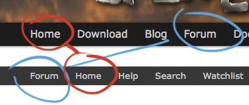
 Just wondered why "Forum" and "Home" are double in the current header. They seem to do the same. At least they could be in the same order...like in the lower black bar first "Home" (like above) and then "Forum".
See screenshot for what I mean.
 That is the forum software, I can not turn it off without modifying the source code (I think!) and I dont want to do that (anymore) as it is too much work to maintain when updating the forum software. Also, iirc the forum link of the forum has a different effect: you just go back to the top, without marking anything as old. Clicking the forum link in the header nav is as if you reenter the forum (post are marked as old... or read? never understood the difference between the two).
Powered by mwForum 2.29.7 © 1999-2015 Markus Wichitill
