Not logged inOpenClonk Forum

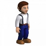
Also, at least for the home page, I need some nice big renderings of some representative (and gorgeous looking) objects. Much like on the glest page
http://glest.org/en/index.php or on the wesnoth page
http://www.wesnoth.org/, I want to use some of these graphics as buttons or title images for texts.

Woah, looks good.
>I need some nice big renderings of some representative (and gorgeous looking) objects.
Can you be specific on which objects you'd like to use? Also, what size should they be?

Anything that looks good. Give it to me in a size of about 400x400, I'll scale it myself then.

Do you think a wipf is unfitting? (since it isn't actually in-game)
I hereby license the following file(s) under the CC-by license
The clonk is to emotionless, you should make him do some position.
What about a 'witty' facial expression?

This doesn't look cool.
1. Perspective rendering
2. You may (but dont have to) compose objects, f.e. have the clonk dig something out with a shovel, show 2 swords and a shield (like wesnoth logo), a lorry full of gold etc. Anything that looks cool and could be used as a logo. If you do anything more time-consuming than a few minutes, commit the "stance"/the scene you made as the underlying models could change.
I was hoping that AlteredARMOR would help out there if he has time cause he made some nice renderings before and you are so
pretty busy with C4Script stuff.
.oO(must have been tired when I wrote this)

I'd love to help (especially since I have some ideas in mind) but currently not able due to my PC's "disorder" :-( Sorry,,,

 By Ringwaul
 ![Canada [ca]](/mwf/flags/ca.png) Date
Date 2010-08-14 00:09
Edited 2010-08-14 00:11

>(must have been tired when I wrote this)
Hahaha, I assumed it was just lost in translation. x)
Also, concerning these icons; I think I will leave this to AlteredARMOR for now. I have been putting most of my efforts into the GUI graphics for the game, and free time is short due to being busy in real life.

Looks cool
Cool? It's great! And really clonky :p

How about some AA in the font?

AA?
Anti-Aliasing, I guess.
But it probably depends on OS configuration (I've got these fonts antialiased in my Ubuntu under Chrome)

> depends on OS configuration...
True

That's an issue of your browser, mine renders the font beautifully. (That said, you might be able to tweak the font to get better rendering on your browser. I'll upload the sfd tomorrow, but I think the ttf contains almost all information.)

Font on Computer: Looks pretty | Notebook: Rubbish. Same browser on both. :(

In that case, you apparently wish for your browser to override your OS settings. There are probably people out there who wouldn't like that to happen on their computer. Maybe the
Cleartype tuner can help you?

Please note that the online tuner does not currently work with Windows Vista.

There's a link to an offline version. Not that I've tested that on Vista, but I'm fairly confident that there's
some way to tune the font antialias settings. While Windows does have a reputation for horrible font rendering, I don't believe it regressed in that aspect with Vista. You just might have to search for it a bit.

If you'd like to use a floppy icon for the download, I can use the same model from the 'save' icons in the GUI for a 64x render or somesuch.

I think it's obvious enough that this is a download link.
Floppies are outdated. I suggest a pendrive.
Maybe that'll change the whole internet? (xD)
A 3.5" floppy is the standard icon for "save". The same way that your cellphone probably shows an icon of a (paper) letter when you get a text message, even though no paper was actually used in transmitting the message. The floppy disk icon will survive its tangible incarnation, although nobody uses floppy disks to store data anymore, and hasn't for some time. In fact, the floppy disk itself hasn't been floppy for some years. Don't change a widely understood icon for no good reason, you'll likely confuse your users (notwithstanding the fact that the floppy icon is perfectly recognizable in low resolutions as well, something that's not easy to achieve with a pendrive).

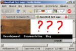
Looks nice, but...

Hmm, anybody know how to turn that off?

Set the min-width of #nav_header and #nav_navigation to something bigger than the width of the content.

No other possibility? Because generally - for other pages than the portal home page, I want to only require 600px width.

See
Günther's post - not using a static width for the content is the alternative solution. But why don't you simply override the normal min-width on the home page?

Looks good, but I don't like static widths.

 Date
Date 2010-08-17 19:19
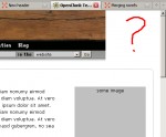
Nice, but becomes messy with a small browser window.

 By AlteredARMOR
 ![Ukraine [ua]](/mwf/flags/ua.png) Date
Date 2010-08-09 07:38
Edited 2010-08-09 07:40

Agreed with Caesar:
P.S. As for the design: I like it (especially I like the way OC logo looks on the wooden background)

Actually the same thing happens with the current design, but nobody complained yet, so it's probably not important.

I have to object:

At least one textual string does not mess with others
P.S. And by the way, it is not that important on development site

I set a minimum-width of the header of 880px or something now.

Yeah, that's it. Nice.
P.S. The Only thing I'd like to suggest due to this issue is to expand the topmost "wooden" bar to the entire horizontal space (it this can be done somehow).
 P.P.S.
 Sorry for being overdemanding :-)

Overdemanding? You only reported a bug.

And it seems that it is already fixed.
Nice.

That's too wide. The submenu entries should simply hide the search form when shown, instead of forcing horizontal scrollbars:
#nav_navigation {
  min-width: 550px;
}
#nav_search {
float:none;
position:absolute;
right:0;
}
#nav_navigation ul li ul li a {
  padding: 2px 8px 8px 8px;
  background-color: #969694;
}
#nav_navigation ul li ul li a:hover {
  background-color: #969694;
}
#nav_navigation ul li ul li {
  padding: 0px 0px 32px 0px;
}

Don't you think it would look a little flimsy if a whole search form appears/disappears just by hovering over menus?

Pop-up-menus that overlap other content on the site are nothing exotic, and we have to choose between that and horizontal scrolling. Horizontal scrolling looses.
Most people have a wide enough browser window that they won't see the problem anyway, but we shouldn't needlessly punish those that do.

OK I implemented it in a similar fashion (min-width now 600px). Can someone tell me how I keep the elements of crunching together if one resizes the window to extreme smallness?

#nav_navigation {
position: relative;
}

ty

Looks good. But your are using Endeavour.ttf. While I have it installed, I doubt visitors will. So you should make sure that it looks as well with another font (and specify it, your are currently just using Endeavour.ttf without alternatives?)

Or linking to it via @font-face.
Powered by mwForum 2.29.7 © 1999-2015 Markus Wichitill


![Germany [de]](/mwf/flags/de.png)
![Canada [ca]](/mwf/flags/ca.png)


![Ukraine [ua]](/mwf/flags/ua.png)
![Poland [pl]](/mwf/flags/pl.png)


