Poll
keep it as it is, or set a new standard (Closed)
| new standardized textureset (orange and lightblue) | 3 | 100% | |
| someone else should do it (keep it until then) | 0 | 0% | |
| The current textures are fine | 0 | 0% |
Hi there,
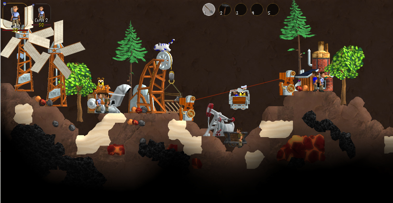
I was working on models for Clonkonauts cable car. By that. I also started using a new, more colorful and friendly palette. as the mud brown colors dominating items and structures were very often critizised. (see compilation picture taken by Nachtfalter or Matthi (sorry, dunno anymore, but there is a thread here somewhere.)
Presenting my cable car exported models, there was a dispute, that the new color palette does not fit to the old stuff, which is true. That is why I quicky recolored the old textures to make them fitting my proposed new style. This is a quick and efficient interim solution until someone decides to replace the old structures (especially the ones which still have some sort of dummy model)
There was already a dicussion about the new color palette, brightness, cleanness, orangeness, without any clear consens. Some liked the orange, some did not. Generally it was said that it might be a bit too bright, however, as soon as I reduce the brightness, it quickly starts to become more brownish again. However the *.material file allows to easily change the brightness without even touching the textures itself.
To make it short and simple, this discussion shall aim on the question: is the old better than the new style/colorpalette?

Imo a bit too bright as you already said. How about this approach?

Probably? I do not know how the texture looks like, I just desaturated the wooden parts in the screenshot it a bit.
If we would make the earth lighter, Markys wood would be perfect imo. I never liked the idea that the darkness of a material helps distinguishing objects from landscape. Plus, earth is the only material that is way darker than before. Why is Rock still light e.g.? Actually, the contrast between tunnel and earth would be bigger and that's important, too.
(Don't misunderstand me, I love the new earth textures. Especially because it looks ten times better when HighRes is deactivated and the saturation is fine, too! It's just so dark...)
(Don't misunderstand me, I love the new earth textures. Especially because it looks ten times better when HighRes is deactivated and the saturation is fine, too! It's just so dark...)
To avoid moving black pixel grids. Luckily, that bug is gone now in a way.
Another point is that we might have too harsh contrasts in saturation for the important objects then.
Anyway, I like Nachtfalter's suggestion more.
I also don't think total consensus is possible in this matter. :)
Your proposal is fine, only I'd dim down the saturation as it stands out from the landscape too much currently. Standing out from the landscape is okay, but it stands out A) too much now and B) the colors of the buildings and the landscape clash now (die Farben beißen sich), which looks unpleasant.
NF dimmed down the brightness instead, I find that too dark. But in his example, at least the colors do not clash that much anymore.
While you are in the process of finding a neat palette, it would be great if you created a picture that includes those palette colors - we are missing such a file from which one can simply pipette the colors for one own's textures.
NFs version is a little better in that his colors don't clash so hard: The darker wood takes a step back and the bright parts of metal get the attention. its much more calm this way - but there might be other ways! Also, the "in front of sky" version of nfs wood might be interesting.
Generally speaking, You'd probably want to use color intentionally to shift the attention to the cool, unique features of the structure and balance the form against the "visual clutter". There is also the possibility of coloring the wood slightly different in different parts for this!
>..and could color the bottom of the buildings more subtle to make ....
That might work pretty well, if we just sold it as "dirt". Because hey, buildings are obviously going to be a bit dirty near the ground!
I don't see why we require a high landscape/building contrast. Other than that, I kind of feel like the metal parts have lost a bit of their plasticity. I don't really have any hard feelings about this though.
I'm not sure what the histograms should tell me. But aren't they image-global averages? Changing the colour of a few bits of the image is not going to change them much, is it?
The solution cannot be to give unique colors to every element. Arguing with the credo that unimportant elements should stand out less than important elements, I would still count buildings to the unimportant elements: As with the material textures, buildings should actually stand out less then elements such as clonks or animals. I do not think anyone would not spot an elevator or any other building in Marky's mockup even if it was exactly the same color as earth because through their large structure alone they stand out from the earth enough that they are visible. Or in other words: The building models alone provide enough detail that they are well visible, it is overkill to make them stand out through their color as well - they already stand out from the landscape.
I do not find it necessary to have a high landscape/building contrast. I do find it more important to have a uniform look and if building-wood and earth have the same saturation, that looks good. Different colors - not only brown - are fine. After all, we have different colors in materials too - blue, red, orange, green, red, pink etc. But they have in common a certain "pastel" saturation. This saturation, not necessarily the hue of the earth-brown, should be shared by everything that the landscape is compromised of - materials, buildings and vegetation.
Right now when I play the game with the new textures, I always feel that I mutilate (verschandeln) the pleasant landscape when I construct buildings and mine stuff in it. That is because the buildings look like they do not belong into the landscape, like a foreign body (Fremdkörper). Color plays a key role in that.
Only Clonks, animals, items and vehicles (in that order) need to stand out, they can have more unique looks. The rest should be uniform and thus pleasant to look at.
tl;dr: landscape elements (buildings, vegetation, materials) should share the same "pastel" color palette to make the landscape feel coherent and look pleasant. Only small moving objects should stand out.
Edit: I extended the text a bit
> Only Clonks, animals, items and vehicles (in that order) need to stand out
I read something similar about Diablo3 (I think?) where they even applied a different shader to the player's character to have him stand out against all the other game elements (some sort of different rim lighting, giving her a clear edge or so).
1. pluto's bright orange-y brown. Buildings stand out most. They are most recognizable, but at the cost of competing with recognition of clonks and other animals standing (in front of them).
2. Nachtfalter's darkened version. Still colored but buildings stand out a bit less. Lies somewhere between 1 and 3.
3. Marky's desaturated version. Buildings have least contrast to earth, but also integrate most. Does not disturb the scene, but at the cost of being less recognizable individually.
4. Current colors. Would be least work to keep.
Did I miss anything? Do people want to discuss more?
I think all versions have some valid arguments and it comes down to personal taste. Maybe bright colors emphasize the chaos that's definitely part of clonk rounds, while the darker/desaturated ones try to achieve some harmony for the whole scene.
I suggest to simply make a poll with these options. Allow selection of multiple options, so we don't need to discuss after the poll which votes would need to be added. Whoever wants to modify colors has community approval to change the color scheme to be approximately like the proposed version.
I started a poll about either accepting my approach for now, or keeping the old stuff. I am not motivated to start a second approach, as these discussions about very subjective things are not appealing for me. (I might change the saturation slightly towards Matthis proposed elevator texture (whoever may know his elevator model&texture) )
Edit1: Oh, I obviously did not read the complete post. New Poll
Edit2: Oh, a second poll per thread is not possible. New thread. Sorry! http://forum.openclonk.org/topic_show.pl?tid=3264
Edit1: Oh, I obviously did not read the complete post. New Poll
Edit2: Oh, a second poll per thread is not possible. New thread. Sorry! http://forum.openclonk.org/topic_show.pl?tid=3264
Idk, I'd put the poll on Clonkspot anyways.
Cool, nice thinking. However I would like to avoid any more "mustard". Just go for the poll ;)
unfortunately this makes double voting possible...
unfortunately this makes double voting possible...
> Maybe they don't even want to share their opinion on OC anymore, because they consider the game a fail overall.
That's nice that they don't post here then. Because I really wouldn't want the opinion about a detail of someone who considers the whole game a fail anyway.
Powered by mwForum 2.29.7 © 1999-2015 Markus Wichitill


![Switzerland [ch]](/mwf/flags/ch.png)


![Germany [de]](/mwf/flags/de.png)

![United States [us]](/mwf/flags/us.png)

