Poll
Which texture set do you prefer
| pluto's bright orange. (available, just needs some tuning) | 14 | 39% | |
| Nachtfalter's darker brown. (NEEDS TO BE DONE by someone) | 10 | 28% | |
| Marky's desaturated version. (NEEDS TO BE DONE by someone) | 8 | 22% | |
| Current colors. Would be least work to keep | 4 | 11% |
![[ch]](/mwf/flags/ch.png "Switzerland")
This thread is a poll in regard of the discussion about a color palette for building (and vehicle) textures, see here: http://forum.openclonk.org/topic_show.pl?pid=31165
I just want to add to that: my texture set is mainly already available apart from potential finetuning, to get some lost details back.
Other texture versions still need to be done by someone (which is very likely not being me in the next time). So basically the decision to make is, having the orange texture set somewhen the day after tomorrow in the nightly built, or waiting for the alternative texture sets for which I do not feel responsible. That means, they can come very soon, but also maybe never.
Copied from Svens last post in the mentiond thread:
So we have the options:
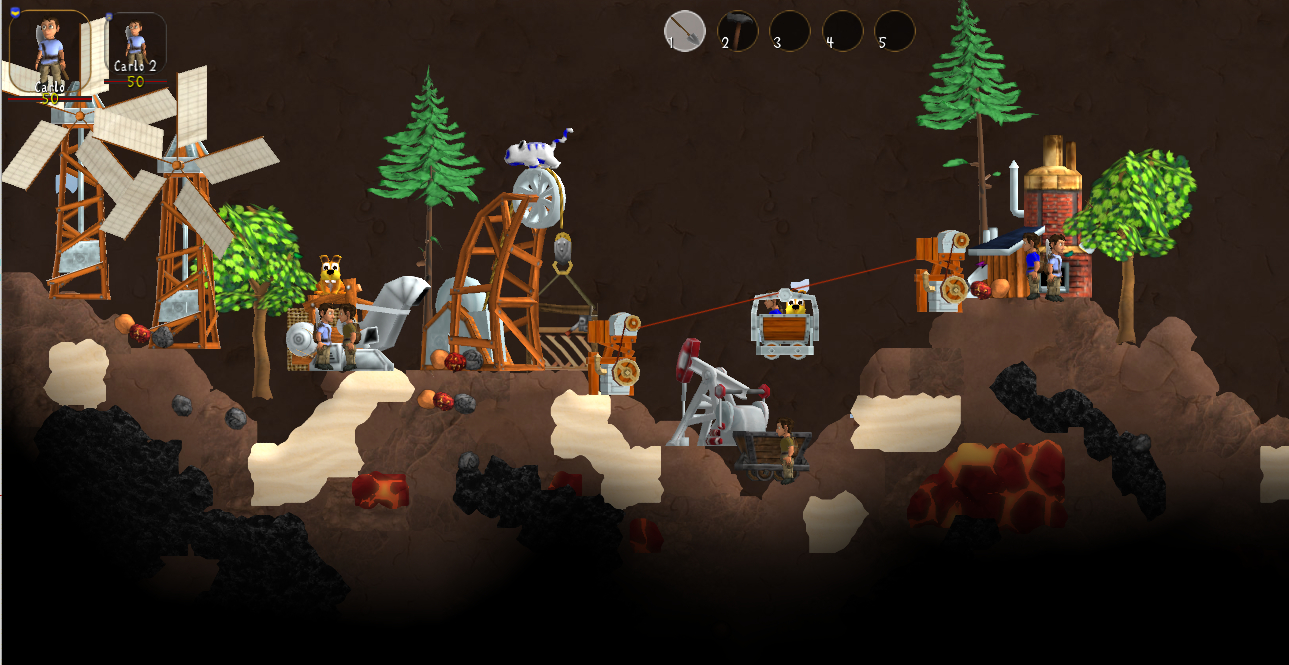
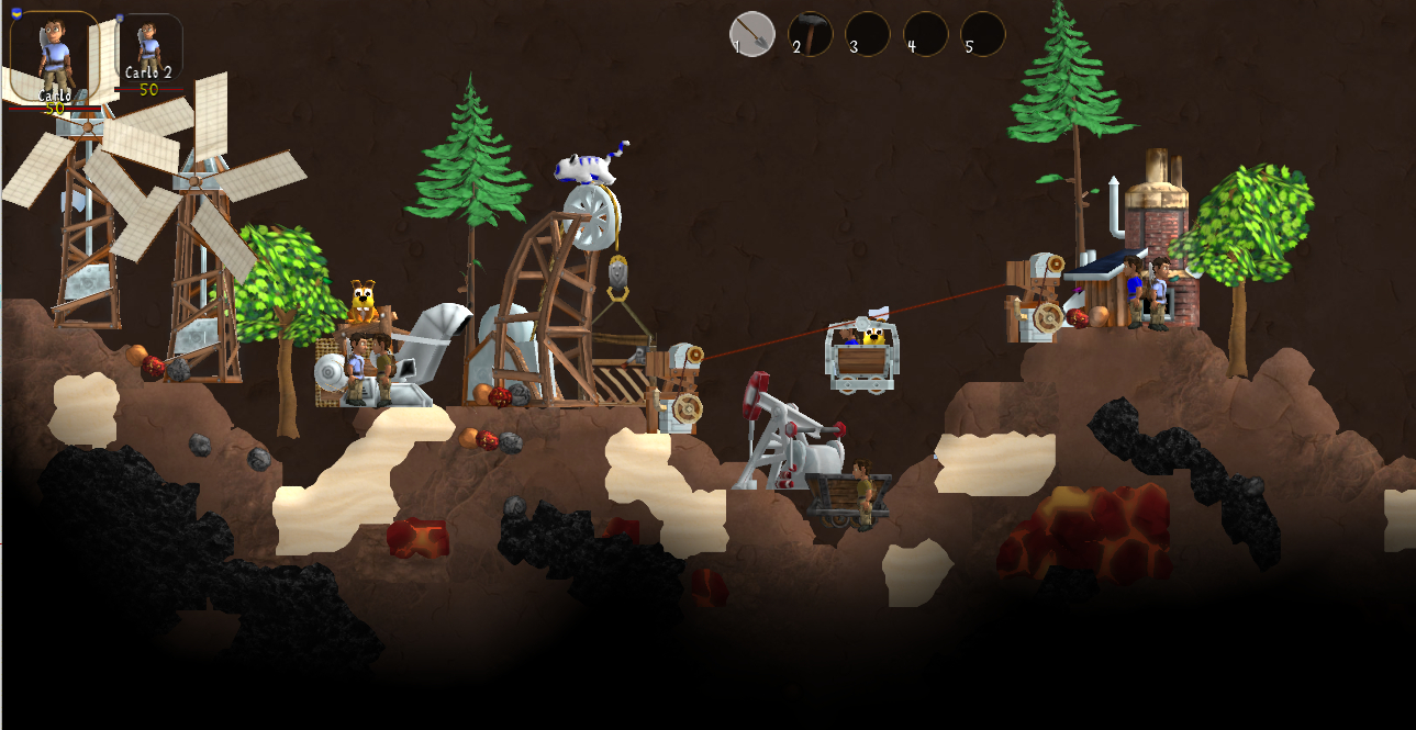
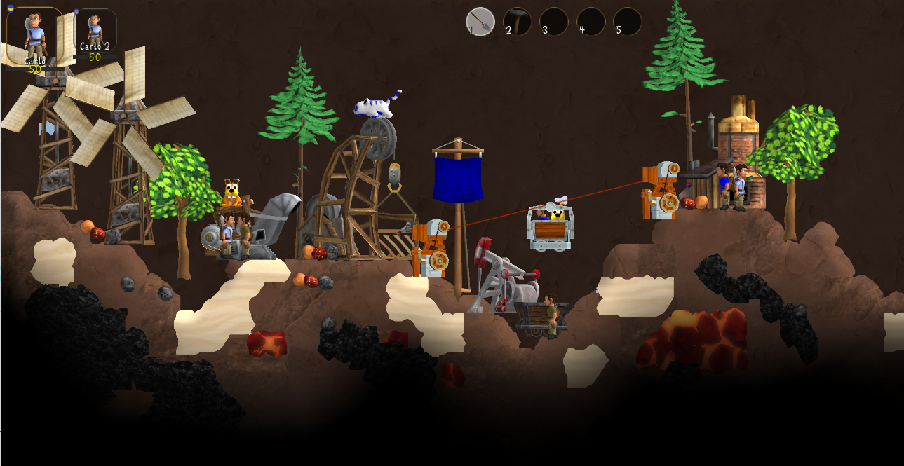
1. pluto's bright orange-y brown. Buildings stand out most. They are most recognizable, but at the cost of competing with recognition of clonks and other animals standing (in front of them).
2. Nachtfalter's darkened version. Still colored but buildings stand out a bit less. Lies somewhere between 1 and 3.
3. Marky's desaturated version. Buildings have least contrast to earth, but also integrate most. Does not disturb the scene, but at the cost of being less recognizable individually. [comment by me: and is quite similar to the current colors, so least effect for work needed]
4. Current colors. Would be least work to keep.
Did I miss anything? Do people want to discuss more?
I think all versions have some valid arguments and it comes down to personal taste. Maybe bright colors emphasize the chaos that's definitely part of clonk rounds, while the darker/desaturated ones try to achieve some harmony for the whole scene.
I suggest to simply make a poll with these options. Allow selection of multiple options, so we don't need to discuss after the poll which votes would need to be added. Whoever wants to modify colors has community approval to change the color scheme to be approximately like the proposed version.
1)
2)

3)
4)
I just want to add to that: my texture set is mainly already available apart from potential finetuning, to get some lost details back.
Other texture versions still need to be done by someone (which is very likely not being me in the next time). So basically the decision to make is, having the orange texture set somewhen the day after tomorrow in the nightly built, or waiting for the alternative texture sets for which I do not feel responsible. That means, they can come very soon, but also maybe never.
Copied from Svens last post in the mentiond thread:
So we have the options:
1. pluto's bright orange-y brown. Buildings stand out most. They are most recognizable, but at the cost of competing with recognition of clonks and other animals standing (in front of them).
2. Nachtfalter's darkened version. Still colored but buildings stand out a bit less. Lies somewhere between 1 and 3.
3. Marky's desaturated version. Buildings have least contrast to earth, but also integrate most. Does not disturb the scene, but at the cost of being less recognizable individually. [comment by me: and is quite similar to the current colors, so least effect for work needed]
4. Current colors. Would be least work to keep.
Did I miss anything? Do people want to discuss more?
I think all versions have some valid arguments and it comes down to personal taste. Maybe bright colors emphasize the chaos that's definitely part of clonk rounds, while the darker/desaturated ones try to achieve some harmony for the whole scene.
I suggest to simply make a poll with these options. Allow selection of multiple options, so we don't need to discuss after the poll which votes would need to be added. Whoever wants to modify colors has community approval to change the color scheme to be approximately like the proposed version.
1)
2)
3)
4)
 Just a little note here: My suggestion was a quick draw in postwork, which is NOT the very final result I would approve. My approach (similar to Mupf) would focus to better fitting Landscape and Buildings together, not to separate them.
 Also,most of the buildings should be redone anyway to create a nice aesthetic and cohorent look in OC. Besides that, I'm not promising anything here, I just contribute things that I like to do.
Please consider this in your vote.
![[de]](/mwf/flags/de.png "Germany")

>Also,most of the buildings should be redone anyway to create a nice aesthetic and cohorent look in OC
That might be true. But recoloring the stuff appears to be actually achievable (as opposed to replacing all models AND recoloring them).
I agree with redoing it. I also see this aproach (as in the former thread said) as an interim solution, until structures are slowly being replaced. I also did not even include the top candidates in the screenshot for a sooner than later replacement. Such as the compensator, which is just some sort of "dummy" gaphic still.
![[us]](/mwf/flags/us.png "United States")
 The compensator is also just a utility building you can construct+forget. In that regard, making it look like nothing is fine.
I totally agree, that it makes sense to use the available ressources of graphic developement in some sort of "effective" way. but your argument of utility building being less important and so are allowed to look like "nothing" is quite nuts. The majority of trees are also just standing arround and you can forget about them. It doesn't mean they should look like nothing.
An "importance" ranking of buildings based on how much you interact with them to define on how much efford should be spend on creating graphics, does not make much sense to me. A sawmill also just is standing arround most of the time, even though you interact quite a lot with that thing. You usually have only one of these in your settlement, while compensators (or wind generators and other utility buildings) you would have more than one. In number of appearance they should be considered more important, if you want to have a pleasantly looking village.
That applies also for the wind generator and almost every decoration object.
> An "importance" ranking of buildings based on how much you interact with them to define on how much efford should be spend on creating graphics, does not make much sense to me.
Sorry, I do not mean to stop anyone from making beautiful graphics. I'm just referring to saliency. I.e. i mean "looks like nothing" not as a quality measurement, but it just means that graphics are toned down to not be the first thing that pops out to you in a village. That's especially true if there are many of them.
It's also a matter of priority. If we rework the compensator graphics now to be more detailed and more defined (even if its colors are toned down and it is not bright orange), it will automatically be more salient than the tools workshop - one of the most important buildings in a settlement - which is still mostly uniformly earth-colored. So I argue to focus on the important buildings first.
So the poll says that my orange version got the most votes compared to the other options. However the majority votes for getting something new which is not the orange, eigher NF's or Marky's proposal. But not Orange. So what. Should I do another poll about "is orange better than what we have now?"

>However the majority votes for getting something new which is not the orange, eigher NF's or Marky's proposal. But not Orange.
I don't think you can add the votes like that, as voting for multiple options is allowed. I like your proposal and NF's adjustment, so I voted for both the first and the second option.
>Should I do another poll about "is orange better than what we have now?"
I think this is already decided, as the current version did only get a single vote.
 I voted for yours because it's the only one that can/will be done. Otherwise I'd have voted for 2 but that's irrelevant. I wouldn't want a solution that won't be done anyway.
Why is it the only one that can be done? I would do it if I had his modified textures, for example.
Feel free: it is all available: https://git.openclonk.org/openclonk-resources.git/tree/HEAD:/graphics
Because pluto said that he would do his suggestion and even fairly quickly so. No one else with a suggestion made the same claim.
I guess the consensus seems to be that most people like a saturated version, but maybe a compromise between yours and NF's?You said yourself, that you wanted to tune your version a bit ("(I might change the saturation slightly towards Matthis proposed elevator texture (whoever may know his elevator model&texture) )"). So maybe that's exactly the compromise that's being looked for?
Otherwise, I'd still like to draw some dirt/shading on top of your textures (example). So I'd say, we should go for it? It seems to be the opinion of most that things need to be changed in some way at least.
 Date 2016-02-10 19:26
Powered by mwForum 2.29.7 © 1999-2015 Markus Wichitill
