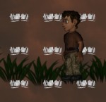
Maybe we could introduce subtle shadow borders between earth and any other non-diggable material - but these should look different from those above. I fear a defined drop shadow such as between earth and tunnel would make other materials look afloat.
A shot at bloom...

I had to remove shadows for this in order to get the needed channel for the pre-processing. Also the current lava texture is really dark, so it looks kind of silly to have it "bloom" over the surrounding (bright) materials.
Finally: The bloom is drawn additively. No idea whether that's the right way to do it, but it looked the shiniest.
Looks a bit weird, but good.
I wonder how it would look if top of water/lava/other liquids would be darkened/brightened slightly....
I wonder how it would look if top of water/lava/other liquids would be darkened/brightened slightly....
By the way: We need one full-screen pass anyway for the fog. Maybe there's a good way to unify them into one pass?
Not sure what you're asking. Could you upload the kind of texture you would like to see?
but besides from this, i still have the feeling that your blooming effect makes the texture less saturated and a lot brighter. the first one is okay, but the second one looks pretty weird imo. if you looks at my picture , the lava itself is pretty strong saturated, and more yellow than the original texture (tho the source texture is the same)
Third one is the best.
Doesn't look as flat as the other two.
Doesn't look as flat as the other two.
The funny thing is that I still don't see why everyone is so fond of number three. The only difference I see is that it "overglows" the sand less.
... I might be the wrong guy for the job. Must remember to leave in lots of parameters so others can fix it later ;)
... I might be the wrong guy for the job. Must remember to leave in lots of parameters so others can fix it later ;)
>fond of number three. The only difference I see is that it "overglows" the sand less.
You don't see the color difference? 1 is too less saturated (too white), 2 glows very strong but in a good color while 3 glows not-as strong and still in a good color.
Sure I see color differences, but not why one seems to be so obviously better than the others :)
Well, I know what it means. But not why it is a problem. Saturation must decrease at some point when you want to get a bright color on computer screens, so when doing additive drawing I thought overflowing the color values into the general direction of white was kind of the point.
> ...to get a bright color on computer screens...
You name it. The only possibility to make something lighter on a computer screen is to make it more white. However, the right color is more important than the right brightness, and you see on photos, it never gets more "white" than a certain shade of yellow. And to simulate the brightness, we use the bloom effect for the lack of the possibility to turn up the brightness for single pixels on the computer screen.
Playing around with adding local lights. The light on the material edges is applied correctly as coming from the center. I suppose this will be easier to see when it's in motion. This could also really benefit from bump maps...
Also note that I have not scaled down the bloom with the ambient light, as I suppose should be "correct". If we go with this sort of dynamic lights, we would have to make sure these cases look good as well.
Also note that I have not scaled down the bloom with the ambient light, as I suppose should be "correct". If we go with this sort of dynamic lights, we would have to make sure these cases look good as well.
Currently this shader only supports one light - supporting greater numbers of them could become a performance problem without additional effort put into, say, subdividing the landscape texture. I am trying to determine whether it's worth it to implement such a thing.
But apart from that, shaders give us great freedom in what kind of behavior we want. I suppose we wouldn't want it to be fully additive, for example?
Edit: Hm, also looking at the screenshot again, it seems I again have messed up the brightness level of the background material. Just look closely at the edge between sand and sky...
First tests using bumps... Notes:
* Only the sand bump map is the one by Newton, the other ones I made up.
* For the first shot, all materials have solid color, so you can see the effect of the bump map exclusively
* I use a *very* naive shading method - just
* Yes, I left the bloom on :)
* Only the sand bump map is the one by Newton, the other ones I made up.
* For the first shot, all materials have solid color, so you can see the effect of the bump map exclusively
* I use a *very* naive shading method - just
length(normal + lightDir), both being normalized vectors. * Yes, I left the bloom on :)
Especially when I animate the direction of the light to pan around, it clearly shows the problem with using "fitting" textures and bump maps: The texture essentially looks like it gets flatter and deeper all the time, because it either cancels out or reinforces the existing shading of the texture.
Examples - light from the top and from the bottom. Ignore that light coming from the bottom always looks very unnatural.
Look at the earth and gold textures to see what I mean: Depending on direction of light, their profile seems to shift radically. Where the shading cancels out, what remains looks washed out. Note also that it appears to happen for gold and earth with different directions.
Also note that Newton's sand seems unaffected. I created the Gold and Earth bumpmaps using some tool. Maybe using his method would fix the whole problem? :)
Regarding the problem of depth-information still in the color map: You could try to X them out. One method could be in GIMP: duplicate the original layer 2 times. Blur the lowest a lot so that the cracks vanish. Change the mode of the middle one to "Farbton" (4th from below). Change the mode of the top one to "Sättigung" (3rd from below).
The depth is a parameter, you will be able to tweak that to your heart's content once it's done. Note also that I strengthened the shading effects in these screenshots to make it easier to discuss (iirc 20% higher on the edges, plus 50% more on all shading).
Hm, I'll look at it.
Hm, I'll look at it.
http://www.mapzoneeditor.com/
I'm curious because I know nothing about such things:
Are the vectors 2d or 3d?
Does a longer vector mean lighter or darker material?
Doesn't this method make everything darker or lighter when adding a light, because shadows shouldn't be even darker when adding a light which doesn't shine there?
If the vectors are really normalized how do you handle smooth ending of the light radius?
I would be reall y thankful if somebody could answer my questions, because I'm very interested such things.
The vectors are 2D. So basically when the light vector is (1.0, 1.0) and the "normal" is (1.0, 1.0), we'd have a solid 2.0 multiplicator, whereas (1.0, 1.0) vs. (-1.0, -1.0) would give you 0.0, corresponding to total darkness.
Besides, immediately after making that post I realized how silly it was not to use the dot product from the start. It's faster on top of having nicer mathematical properties. For the screenshot in my follow-up post, the formula is actually
Besides, immediately after making that post I realized how silly it was not to use the dot product from the start. It's faster on top of having nicer mathematical properties. For the screenshot in my follow-up post, the formula is actually
1.0 + dot(normal, light) already.
[Edit] Nevermind. Posting somewhere for help virtually guarantees you're going to find the (unbelievably stupid) mistake yourself five minutes later. Mission accomplished.
Okay, now we're getting somewhere. Scaler works. Texturing is next.
Scaled and textured... Still lots of work ahead. Note I just resized all textures. They must now all be 512x512, otherwise I can't pack them into a 3D texture.
Powered by mwForum 2.29.7 © 1999-2015 Markus Wichitill


![Canada [ca]](/mwf/flags/ca.png)
![Germany [de]](/mwf/flags/de.png)
![United Kingdom [gb]](/mwf/flags/gb.png)
![Poland [pl]](/mwf/flags/pl.png)


![Panama [pa]](/mwf/flags/pa.png)
