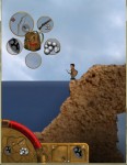
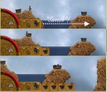
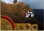
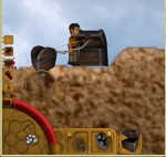
what do you think?
(both pictures have the same material)
Anyawy. groar manabar!
also, shadows!!1
By the way, the clonk on the screenshot holds the bow in the slot labeled as "L" in his right hand. This might be a bit misleading.
>The hotkey number display should be another color or even style though. Possibly the same style as the L and R.
i tried to make it looks like it, but fiddling around with SetClrModulation() did not give the wished effect. i guess i will render the numbers in the same way the LR is.
>IMO we should avoid Comic Sans MS. There are tons of (free) fonts which fit to the new HUD style.
sure, if you find a good one. i actually find this one pretty fitting, but im ok with any other cool looking font.
>Also, I am not quite content with the backpack display being a completely solid bronce plate with that flower-thing in the middle. I dont really like the insets for the items in the inventory slots either.
wait, what? werent you the one who suggested that earlier...? (i could be wrong too)
actually, i like the inset-style pretty much. still i agree with you on the backpack thing - do you have any ideas in mind?
>By the way, the clonk on the screenshot holds the bow in the slot labeled as "L" in his right hand. This might be a bit misleading.
seems this is a conceptual mistake: Left mouse button items were placed in the right hand and vice versa. i think this should not be changed in the HUD, but in the clonk-script (shouldnt be too hard to do)
> sure, if you find a good one.
What's wrong with Endeavour? If you want to replace it, we should do that all at once, not piecemeal.
> actually, i like the inset-style pretty much. still i agree with you on the backpack thing - do you have any ideas in mind?
Not really. You could create some quick mockups to see if this or that looks better.
AddHUDMarker(int payer, picture, int duration, int urgent, object inform). - player is obviously the number of the player you want to inform.
- picture can either be an ID or an object: in the first case, the general graphics for that object type will be displayed, the last case the graphics of the object as it currently is ingame will be displaed (helpful for displaying clonks in those markers).
- duration can be used to auto-remove the marker after a certain time. use 0 for infinite markers.
- if the urgent-flag is set, the marker will smoothly fade into red and then normal again, with a frequency of 1Hz.
- at last, if you pass an object to inform, whenever the marker is clicked, this object receives a "
MarkerSelected(object marker)"-call ( or a "MarkerAltSelected(object marker)"-call, if you right click), giving the marker itself as parameter. same applies for the destruction of the marker (MarkerRemoved(object marker)).markers can be used for almost everything: Building completed,Clonk drowning! (urgent) or You have struck adamantine! Praise the miners!.
if you have any good ideas what can be improved, let me know.
edit: on the picture, you can see (from top to bottom)
- Empty marker
- The chest you can see next to the Clonk, in the opening-action (urgent)
- A general lorry
- Dynamite, also general
- The Clonk, as he is seen ingame
For example if you really wanted some sort of status markers (frozen, wet, ...)
Also: Sound on incoming marker?
>I think the "default" markers we add ourselves would need simpler icons, though.
>Maybe even further simplify the plate they're on?
i think the plates are pretty simple, i dont see how i could make that plate even simplier.
who is "ourselves"? the markers never set by the player, if you mean that.
>It should be easy to make out what's going on with a quick glance.
i think that is currently the case.
>Also: Sound on incoming marker?
hmm. I dont see why not, but i could get annoying if there are added a lot markers.
> i think the plates are pretty simple, i dont see how i could make that plate even simplier.
by removing the border, maybe even flatten the texture. it's just a suggestion though, might work out with simpler icons alone as well.
> who is "ourselves"? the markers never set by the player, if you mean that.
"ourselves" as in "we who provide the original content". Obivously we can't force our design decisions onto the community developers who add their own custom markers.
> i think that is currently the case.
Looking at the dark, blocky images of lorry and chest, I really couldn't distinguish them right away. We'd definitely want some simple, remarkable shapes with good contrast against the background.
> hmm. I dont see why not, but i could get annoying if there are added a lot markers.
Optional, maybe.
>by removing the border, maybe even flatten the texture. it's just a suggestion though, might work out with simpler icons alone as well.
i think with "Icon" you mean the one that is displayed on the brass plate. of course you can set any icon you want.
>"ourselves" as in "we who provide the original content". Obivously we can't force our design decisions onto the community developers who add their own custom markers.
i think you misunderstood how the markers work. the icon (in the picture: the chest, lorry, dynamit or clonk) can be set via script. thus, everyone can make their own markers.
>Looking at the dark, blocky images of lorry and chest, I really couldn't distinguish them right away. We'd definitely want some simple, remarkable shapes with good contrast against the background.
as said, the icon can be manually set by everyone via script. so you can make a good distinguishable icon you want for every event you want to cover.
> i think you misunderstood how the markers work
Nono, I got that part right, and you pretty much summed up what I was trying to say:
> [the icon can be set] via script. so you can make a good distinguishable icon you want for every event you want to cover.
That's my point - that's something we need to do. Lorries, buildings, items and all other ingame objects are not distinguishable icons at all, so we shouldn't reuse them there. I also know that you didn't say we should, I just wanted to point that out! ;)
>That's my point - that's something we need to do. Lorries, buildings, items and all other ingame objects are not distinguishable icons at all, so we shouldn't reuse them there. I also know that you didn't say we should, I just wanted to point that out! ;)
sure, just go ahead :)
The idea behind the markers was to inform the player of certain stuff that would usually be shown in local message in CR (research complete would be one example).
Additionally it is the place where you can inform the player of stuff that he could not see because he is digging away like a mole somewhere - for example that your base is being attacked or that one unselected Clonk is taking damage (for example because he was hit by a meteor and now is on fire!)
PS: The additional value from those markers (goals could notify their fulfillment status when you reach a certain milestone for example) is also not to be underestimated in my opinion
From that clear application now to something a little bit less cool:
Help messages for new players!
I am not talking about help messages that show the description of stuff you build.
I am talking about help messages for special events that are not clear to the player and might frustrate when you first encounter it and fail.
Let's say we have evil monsters that lure in (clearly visible) mounds in the ground. A new player might jump onto the mound and die to something frightening. The message (when you get close to the mound) could just be something like "Be careful around those mounds" as I still want the players to discover 99% of the game themselves.
Same for a player who discovers a bow for the first time: A friendly "You need arrows for the bow!" could probably replace any tutorial.
Hey, a game over there that isn't frustrating and depressing! Let's play that instead!"
Powered by mwForum 2.29.7 © 1999-2015 Markus Wichitill


![Canada [ca]](/mwf/flags/ca.png)
![United Kingdom [gb]](/mwf/flags/gb.png)

![Germany [de]](/mwf/flags/de.png)
![Costa Rica [cr]](/mwf/flags/cr.png)


![Ukraine [ua]](/mwf/flags/ua.png)
![Guatemala [gt]](/mwf/flags/gt.png)


![United States [us]](/mwf/flags/us.png)
