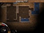
do you agree with this? and if, do you have ideas how to fix it?
here are some of my thoughts:
- add a seperate health bar for the active clonk on the left side on the screen, same as in previous clonk titles.
- add a a halftransparent border to the screen once the clonk has lost a certain amount of damage (maybe with increasing strength). this border should not hinder the sight, but visible enough to make the player notice the low health
>- add a seperate health bar for the active clonk on the left side on the screen, same as in previous clonk titles.
I am all for having a dynamic bar system. And using it for the health too, of course :)
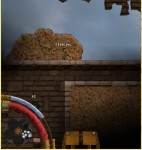
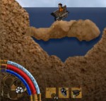
as you can see, there is a rounded tube in the left bottom edge of the screen, framing a display of the current backpack. right to it are your items shown as usual.
(think as if the health meter on the top left screen is not there)
> (think as if the health meter on the top left screen is not there)
What if you have more than one clonk?
Though, I have to say that I "use" the big hud picture of the Clonk often to see when he is finished loading the bow etc. Perhaps, Mimmo, you could try out how it looks like if one HUD element is a really big (bigger than now) live-rendering of the current clonk.
>Though, I have to say that I "use" the big hud picture of the Clonk often to see when he is finished loading the bow etc. Perhaps, Mimmo, you could try out how it looks like if one HUD element is a really big (bigger than now) live-rendering of the current clonk.
I also found myself looking at the picture there to see whether the musket finished loading :)
What about keeping the general crew representation as it is and just shrink the unselected crew members down a lot. 1x1cm or something. When they lose health they can still flash or something..
>The backpack is always open this way? It will be a pleasure to switch items just by klicking on them while jumping around.
I think the current way is a lot faster after you got used to it - because you actually have the backpack around your mouse cursor and just have to move your mouse a few pixels :P
(the backpack should still be usable - but the Q way will probably always be faster. Except you play with a graphics tablet)
>(think as if the health meter on the top left screen is not there)
Hmm, just disable it with one clonk?
the breathe meter rotates into the screen when needed, so it doesnt cover imrpotant things when not needed.
Generally, the half-transparent-black-area design from me does not really fit to the graphically more elaborate design of yours. That is why the backpack and hands display does not really fit currently.
Ideas for hands-display:
+ Use renderings of hands as background (they already exist in the resources repository), alternatively (dark) gloves
+ use a clockpunky-looking brassplate with screws or whatever as background of both items that is somehow connected to the brass of the health bar
Additionally: The breath bar should be should be less decorated (= less visually pre-eminent) because it is not important most of the time. Perhaps it looks ok if it is just a glass tube without any brass elements. It could also look interesting if moved a little bit behind the health bar (1/4th) or/and if the breath actually consisted of bubbles or of water (water full = no breath left). At least, this "air color" is very predominant. If this color is used, it should be much more transparent.
Regarding an earlier suggestion for a HUD arrangement you posted in the IRC: Not so good IMO for various reasons. One predominant reason: You mixed together the player HUD and the clonk HUD. In my/the current HUD arrangement, this is clearly separated: Player-wide HUD above, clonk-specific HUD below. Also, keep in mind that it is only possible to arrange content for the HUD relative to the corners when designing an arrangement.
i agree with what you said about item slots. i think the idea with the brassplates is the better one, it would fit better to the rest of the UI.
i dont think the breathe bar should be behind or be covered by the health bar. but since like, everyone mentioned it now, i guess i need to give it a try at least. i agree with making it transparent.
the earlier suggestion of the hud has been thrown away in like the minute it was posted. nevermind it.
>: The breath bar should be should be less decorated (= less visually pre-eminent) because it is not important most of the time. Perhaps it looks ok if it is just a glass tube without any brass elements. It could also look interesting if moved a little bit behind the health bar (1/4th) or/and if the breath actually consisted of bubbles or of water (water full = no breath left). At least, this "air color" is very predominant. If this color is used, it should be much more transparent.
The breath bar will not be visible when it is not important - that is: When you are not diving.
But WHEN you are diving it is actually important enough to give it a strong focus and not make it transparent.
I disagree with making it more unobstrusive.
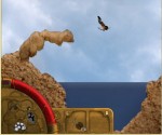
i removed that metal-spline which winds around the tube at the area, where it actually rounds the glass.
you can also see my first attempt for the item-display:
(item display is photomanipulation btw)
@Newton: Did you take into consideration that the bar would only appear when drowning or do you still find it too flashy knowing that now?
PS: The item slots look interesting. But the general style should probably also be used for the backpack in the lower left corner. At least you should probably scale up the backpack image to cover the whole circle (in the background of course)
>@Newton: Did you take into consideration that the bar would only appear when drowning or do you still find it too flashy knowing that now?
No, I didn't. I don't think it will look any good if you have disappearing/appearing elements in a HUD that is this graphically this elaborate. And the more obstrusive the design of that breath bar is, the more the sudden appearance of this will look odd. If the breath bar is going to appear and disappear when drowning, an appearing-animation could be used. F.e. it is put into place from behind the health bar. But all in all, I don't think that any variation of appear/disappear will look good for such a big HUD element.
>the more the sudden appearance of this will look odd.
It does not appear suddenly. It rotates nicely into the screen. You should ask mimmo for some test games when you are on IRC :)
>I don't think it will look any good if you have disappearing/appearing elements in a HUD that is this graphically this elaborate.
Actually, that's what I first thought as well. But after test-playing, I noticed that it's actually a /good/ thing, because you'd notice instantly when you start drowning.
Also, it really rotates into view rather nicely.
Comments:
Tubes:
The health tube is finished i guess. if we will have some poison effects or something like this, i could make an effect which turns the liquid green to show the clonk is poisoned.
The breath tube works fine.
Zapper suggested a dynamic bar-system as it is currently implemented for the portraits of the clonks (add/remove tube, color, state and stuff), but this has currently a low priority for me.
Item Slots:
Work the same way they did before. Any comment on their visual design, besides that the color does not 100% match the color of the tubes? Also, i don't feel like making a non-transparent background for objects with Extra Slots (see arrows in bow).
3D - Portraits of Clonks
After some talk with Zapper and ala, i found the idea of having the 3D-portrait expendable pretty nice. Explanation: the top left display consist of 3 parts: the current portrait, which always show the current clonk with name, rank and name, along with the 3d-model of the clonk. This element is unmovable, unclickable and always shown. Right next to it, theres a row of another 3D-portraits of different Clonks (Monitors), and at last there are the small sized labels which show the clonks hotkey and number (Labels). The player can click on an icon on the Label to monitor a clonk. A monitored clonk still occurs in the Label-list, but additionally, there is a Monitor for that clonk, showing the clonk in 3D, along with name and rank (and maybe hotkey). Vice versa, one can click on a small icon on the Monitor to un-monitor the clonk, closing his Monitor. This leaves the player the choice if he wants to have all his clonks visualized (in a large settlement which a lot of clonks doing lots of things), or concentrate on a few clonks (The archer on the tower and the swordsman in the field). Along with this there could be hotkeys to un-monitor all clonks, hitting the same button again would re-monitor all the clonks which have been unmonitored (to quickly free the UI in a fight for example).
The Labels will also show if something is wrong with a clonk. The Label will flash red if the clonk takes damage, and blue if he is about to drown. Another idea would be to show the type of damage the clonk takes, visualized by a small icon (Arrows for attacked by bow and stuff.). Another idea is to show the two icons of the clonks in the Label as well.
If selecting the clonks via [shift]+[num] is changed to a modifier which is not used for something else (shift for throwing), hitting that modifier could show the hotkey-numbers above the clonks, so the player can quickly distinguish which clonk has what hotkey. Another idea is, that hitting this modifier + clicking in the landscape actually selects the clonk which is closest to the point the player clicks.
.
So i threw in some ideas. what do you think about them?
>This leaves the player the choice if he wants to have all his clonks visualized (in a large settlement which a lot of clonks doing lots of things)
But you still can completely hide all the bars, right? Because that was the intention behind that system.
>including mana
What?
the backpack ist still in the bottom left corner as shown in the picture in the post i replied to, the rest of the action bar has the same themed plates as for the items are are positioned rights to it, like its now.
i will post a picture later.
what especially dont you like about the current layout/positioning?
edit: heres the picture: the mana tube currently works as a breath bar, thus showing such a high value.
> what especially dont you like about the current layout/positioning?
The backpack and tubes don't fit together very well. The backpack just "floats" in the corner and has a different visual style than the tubes. I can think of four ways to improve the design:
1. change the perspective of the backpack so that not (just) the belts are overlapping with the tube. I think a perspective like the shield in the above screenshot would be more fitting. Also, there is no padding between the tubes and the screen border, perhaps it could look good if the backpack is enlarged too so that there is no padding between the screen and the backpack (and thus parts of the backpack are not shown)
2. The transparent black circles do not fit anymore with the new design. Especially on the backpack. I think you should either remove them altogether or replace them with something that fits better. (A glass ball in the style of the tube glass? hmm, don't know...)
3. With the brass plates replacing the transparent black rectangles in the action bar, it looks odd IMO if the items shown are not completely enclosed by the brass plates. For the black rectangles it looked good but for the brass plates, dunno. Also, since the hand items are actually a pretty important element in the HUD, I'd just make them bigger. Also, the extra slot display should be changed into the brass style. Did you know that you can drag and drop the stuff in the extra slot? It could be a slightly darker indentation/panel ("Vertiefung") in the brass plate. Additionally, for better visibility I'd add a slight shadow to the items shown in the hand slot (=just make the plate background a bit darker in the middle). Also, there is a padding between the border of the screen and the brass plates. It might be worth a try to redesign them in a way that they stick out from the bottom of the screen like the tubes do.
Edit: 4. Now that I saw your screenshot: the hands display must be larger and visually different than the action bar. It is more important and it is something completely different. One possibility would be to make the left and right item appear together on one big connected brass plate (sticking out from the border from the bottom).
Also, if you plan to show only the current clonk (in full size), perhaps you should think about moving a (larger) version of the clonk's title graphic directly above the tube display. After all, the display of the currently selected clonk belongs to the HUD of the currently selected clonk (thus, the lower HUD), not the player HUD (the upper HUD). But not only for this reason it should be moved to the bottom but also because this forms a nice regular shape together with the hands display to the right. See the attached image for what I mean - the white border.
>Any opinions on this?
Yes. Magic is dumb and (seriously) shouldn't leave traces in the core objects. Your typical shooter will need some kind of ammo bar, the next guy wants some experience bar, and we don't provide those in the core packet as well (because we have no reason to). Stuff like this really should go into the pack which needs it, so I agree with designing an interface for that.
>1. change the perspective of the backpack so that not (just) the belts are overlapping with the tube. I think a perspective like the shield in the above screenshot would be more fitting. Also, there is no padding between the tubes and the screen border, perhaps it could look good if the backpack is enlarged too so that there is no padding between the screen and the backpack (and thus parts of the backpack are not shown)
well, that is the most obvious solution, which i also like. one problem with this could be, that if youre in the bottom left corner of the map, your clonk is hidden, but this could also happen now. i dont really like the idea of hiding everything behind it completely. i will try out how it looks, i will merge the backpack model into the tubes model and make the belts overlap the tubes as you mentioned.
.
>2. The transparent black circles do not fit anymore with the new design. Especially on the backpack. I think you should either remove them altogether or replace them with something that fits better. (A glass ball in the style of the tube glass? hmm, don't know...)
i dunno. i dont dislike the black circles that much, but i can try a different style of course.
.
>3. With the brass plates replacing the transparent black rectangles in the action bar, it looks odd IMO if the items shown are not completely enclosed by the brass plates. For the black rectangles it looked good but for the brass plates, dunno. Also, since the hand items are actually a pretty important element in the HUD, I'd just make them bigger. Also, the extra slot display should be changed into the brass style. Did you know that you can drag and drop the stuff in the extra slot? It could be a slightly darker indentation/panel ("Vertiefung") in the brass plate. Additionally, for better visibility I'd add a slight shadow to the items shown in the hand slot (=just make the plate background a bit darker in the middle).
i disagree partly. i dont think that the plates need to cover the items whole, i find it okay the way it is at the moment. if i would change that, the plates would need to be bigger in order to display the items in the same size, which would lead to even more screen coverage. i also disagree with moving the extraslots at the top as pictured in your draft, plus i think that the black circle for them fits here pretty much. i dont want to cover the actual item so much, as well as i dont want to move the extra slot too far away.
.
> Also, there is a padding between the border of the screen and the brass plates. It might be worth a try to redesign them in a way that they stick out from the bottom of the screen like the tubes do.
i dont really find that bad. also, i cant imagine making it so that it doesnt look bad, the way you mentioned.
.
>the hands display must be larger and visually different than the action bar.
agreed.
.
>Also, if you plan to show only the current clonk (in full size), perhaps you should think about moving a (larger) version of the clonk's title graphic directly above the tube display. After all, the display of the currently selected clonk belongs to the HUD of the currently selected clonk (thus, the lower HUD), not the player HUD (the upper HUD). But not only for this reason it should be moved to the bottom but also because this forms a nice regular shape together with the hands display to the right. See the attached image for what I mean - the white border.
i didnt plan this yet, but this could look nice. there could also be a copper brass around the whole bottom hud (clonk, tubes, hands), but i fear that it will simply cover too much of the landscape and stuff.
.
>Hmm, IMO it would be the better solution to offer an interface for object packs (like a magic pack) to create it's own bar and make the "magic" physical a property ...but well that's not so important I guess. Any opinions on this?
i dunno. i dont see why there shouldnt be a magic bar in the main package.
These were all suggestions what could look better for you to try out. I am not sure myself if the one or the other idea will look good or not.
see attachment
black circles (almost) begone!
Powered by mwForum 2.29.7 © 1999-2015 Markus Wichitill


![Canada [ca]](/mwf/flags/ca.png)
![Germany [de]](/mwf/flags/de.png)
![United Kingdom [gb]](/mwf/flags/gb.png)
