Not logged inOpenClonk Forum

You should probably use different layers for these 3D models instead of having them all in different .blend files.

Here you go

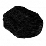
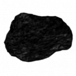
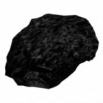
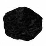
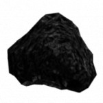
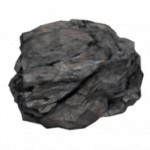
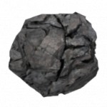
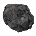
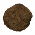
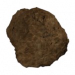
Incredible work! Certainly better than those 5-minute-job placeholders of mine. :D I think the coal looks good too, though maybe
just a bit dark.

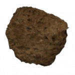
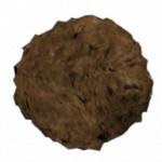
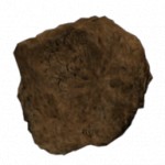
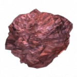
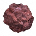
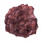
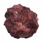
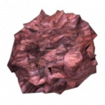
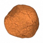
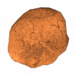
rock: Should be a bit lighter - perhaps you can use a rock texture from the Material.c4g; The rock is imo a bit "too" splintered
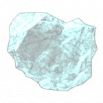
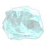
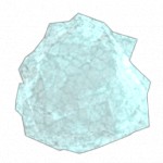
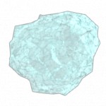
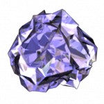
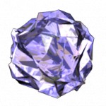
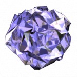
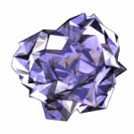
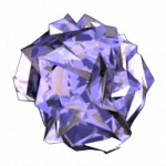
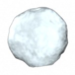
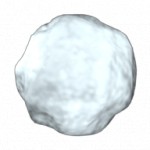
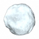
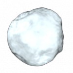
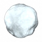
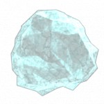
ice: Try using the ice3.jpg texture from the repos

Rock: Well, at least it looks like it was mined using explosives :-) (just kidding). No problem, I can "cut some edges". It already uses the texture you've mentioned (
the second one) - hope I'm not mistaken
Ice: I've tried. I do not like the result (it looks more like snow). I know we must make material texture and mined object look the same but if I have to I would like to find another ice texture.
Any suggestions about coal?

Coal looks good (the one displayed in your post).

I didn't like the Ice, I think it's to blue. I prefer it with a more whitish color.
I hereby license the following file(s) under the CC-by license

Probably you are right (this will also give it more similarity with the material texture). And I like it better that way.
Did you alter a model or just a rendered image?

I altered the model, I think only playing around with the material.

Thanks for the attachment.
Probably we should wait to see what other people think about it

This is the exact image I was looking at during modelling process :-)
Yeah. It looked fine on dark background but now it is too transparent. I will modify it at a later time.
Or care to give a hand?

This is not so transluctent now, but I 'm not really happy with it :/
I hereby license the following file(s) under the CC-by license

Anyway thanks for the help. (Bacause I do not know when I will be able to modify this one)

 Date
Date 2010-02-08 20:38

I was trying to implement these, but
this bug is stopping me from making randomly chosen graphics on initialization. :(

What graphics do you actually mean?
Sorry, I didn't understand anything...

I was going to use your graphics for objects in OC, but the aforementioned bug stops the objects' graphical changes.
ie: I dig a piece of ice, it has the first ice graphic and appears properly. I dig another piece of ice, it uses the second ice graphic, but does not appear (due to the bug).

Oh, I see. So "theese" in you post meant "different graphics for objects". Sorry for misunderstanding

By the way. If you can do not limit the number of different graphics to just 3. I will surely want to add more (5, 7 or even 10) later.
P.S. So can you?

>P.S. So can you?
Yes.

Thanks. So I will make 2 more for each later. I do think that 5 would give a nice variety to the material objects (more than 5 makes and no sense, actually, and it will be hard to create another piece of material that slightly differs from those already modelled). So lets stick to 5 (no 7 or 10 :-)

You can add as many as you want. If you think one is enough for loam, so be it. You don't have to have 5 for every material if you got 5 for rock.

Implement it pretending the bug is fixed

Hmm, okay then.

Well, I've done this for almost all the materials, except I've run into a small issue. It seems that SetGraphics(Format("%d.8",Random(2))) will change the in-game graphics accordingly, but it doesn't change the inventory graphics (though they should be the same picture).

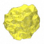
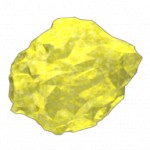
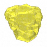
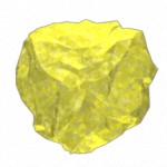
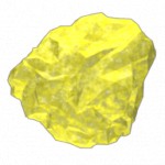
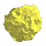
Sulphur is not transparent at all.

Yeah. Sorted this out already. But right now I do not have inspiration to remodel it. :-(

These are looking amazing. :D For sulphur, I agree with newton. Sulphur has a lemon-yellow colour to it;
here is a good reference image.
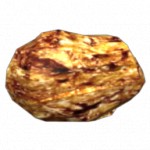
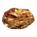
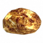
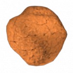
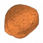
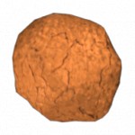
The flints look strange. Try a more "cracks of lava" texture, with earthy-red for the shell.

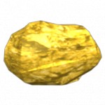
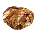
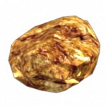
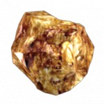
Gold nugget: Try ligthing it more so that it appears more contrasty/ligher.

OK. I will try this in the evening when I come home.
Edit: Even if this doesn't work, I think I know how to make it look like gold...

How about this?

Looks very nice, imo.

You would probably laugh but the problem was the lack of lighting :-) My bad: I didn't notice that it was lighted by a single lamp. So when I added two more lamps it gained the "gold look" which you can see on this picture (and 3 pictures at the top if you clear your cache).

After testing it in game, I think it needs to have more bright-yellow in the texture, and less brown. It is not easily recognizable as gold, and doesn't altogether match up with the Gold landscape material.

A screenshot? :-)

(stupid update not allowing empty message)

 By AlteredARMOR
 ![Ukraine [ua]](/mwf/flags/ua.png) Date
Date 2010-02-14 09:14
Edited 2010-02-14 10:10

Thanks, now I see the problem. (I think a small texture tweak should do the thing)
EDIT: Check this out:

Well thats not quite right. At the end, the textures of the materials will be displayed in a 3times higher resolution thus giving the gold more brownish cracks and details when zoomed in too. A simple light color modulation will do but I suggest that you do it later when the materials aren't displayed so blurred anymore.

And by the way. Gold chunks (as well as other materials) looks WAY TOO BIG. Maybe they can be shrunk a bit?

No, I don't think so. I think rocks in clonk should stay "head" size. If not you couldn't reconize them good if not zoom in very much. And a clonk holding just one tiny spec of rock in his hands looks wierd. Such a tiny spec also couldn't be used as a weapon when throwing it. (And throwing rocks is clonky, isn't it?)

Yeah, throwing rocks is 100% clonky! :-) But throwing huge headsize rocks is "get his head cracked with one precise throw". Due to the high level of injury a gold chunk falling over ones head should be not "a very prized find" but the "very LAST find". Indeed.
P.S. Leave them as they are now. It is really NOT an issue we should be concerned about at the moment.
P.P.S. Just looked at your avatar for a while and came up with a thought that material objects should probably be the same size as the crystal there. So, from one side, it can be carried and throwed easily, and from another side, it would not lead to unrealistic use of environment objects (clonk should be REALLY strong to throw a rock that has the same size as his head)

I've never really thought much about this, but I've concluded as Randrian was stating, that these objects would be impossible to see ingame if they were a realistic size. Materials in Clonk have always been very 'iconic'; it is more important that you can see them than being a little more realistic.

 By AlteredARMOR
 ![Ukraine [ua]](/mwf/flags/ua.png) Date
Date 2010-02-17 17:49
Edited 2010-02-17 19:41

Probably you both are right (since you actually implement all this stuff and I am only gazing at the final result and grumbling about something "not quite good" and "not the way it could be if it was somewhat better than it had been the moment before it had become even worse"). What I wanted to say I sad already:
> Leave them as they are now.
Really.
We have other issues to deal with at the moment.

A cookie with some chocolate. Delicious!
Yes, this version is much better!
Can't wait to start diggin!

>Looks transparent? Currently I am out of any ideas of improving it. I will try again at a later time but will gladly appreciate any help as well
B_Es sulphur looked good. Why not use that one?
>flint
I like
http://forum.openclonk.org/topic_show.pl?pid=6367#pid6367 + some lava-like cracks.
Powered by mwForum 2.29.7 © 1999-2015 Markus Wichitill



![Ukraine [ua]](/mwf/flags/ua.png)
![Canada [ca]](/mwf/flags/ca.png)
![Poland [pl]](/mwf/flags/pl.png)
![Germany [de]](/mwf/flags/de.png)
![United States [us]](/mwf/flags/us.png)
