What does this mean?
• Yes, shiny new materials!
• Oh no, every scenario has to be aligned to the new materials! :(
The materials are mostly "as-is", this means small changes can be done, if they fit into the style. Also, summer-winter Edition.
Let me know what you think and try it yourself!
For me it looks like it is easier for new players to distinguish between the different materials now (except for the ore, it could be a bit more purple-ish imo).
These painted materials ara a googol times superior to the current ones. In terms of looks and distinguishability.
Edit: Oh you mean the painted ones are better to distinguish?
Once we have object behind material we would be able to see them, otherwise we would at least see some tunnel and sky from behind.
I'm quite satisfied with all other materials, although I share the impression that ore (in the right corner of the collage?) is not that well distinguishable, although I kind of like the plain way it is done.
These are new material textures that have been developed out of the "OC Milestone Project" and are already supported by quite a few people (including me). Intention is to replace the current OC textures.
Comparison of old and new sets says:
Acid - just replace
Amethyst - just replace
Ashes - missing
Brick - just replace
BrickBack - just replace
Coal - just replace
Earth_* - formerly 5 variations, now 3
Firestone - just replace
Gold - just replace
Granite - just replace
Ice - formerly 2 variations, now 1
Lava - just replace
Ore - just replace
Rock - formerly 2 variations, now 1
Ruby - gone*
Sand - formerly 2 variations, now 1
Snow - just replace
Tunnel - just replace (ignore "Kopie")
Water - formerly 4 variations, now 1 (for animation, I guess? Could someone elaborate?)
*: Question is whether we do need 2 materials that serve the same purpose. I has been noted that there are scenarios that utilise amethyst and ruby in different ways. Maybe a colour variation might suffice?
> *: Question is whether we do need 2 materials that serve the same purpose. I has been noted that there are scenarios that utilise amethyst and ruby in different ways. Maybe a colour variation might suffice?
Yes, both distinct materials are needed for the current scenarios. At the moment, the difference is only important in Deep Sea Mining, but it is very important there. For scenario design, it's generally useful to have different kinds of valuable materials. It also allows a kind of team melee concept where two teams battle for different resources.
For the graphics, shifting hue of the texture would be enough I think.
>At the moment, the difference is only important in Deep Sea Mining, but it is very important there.
Could you elaborate?
>It also allows a kind of team melee concept where two teams battle for different resources.
Gold and Diamond are two valuable materials!
Of course there would be different solutions. For example, gems could be hidden in chests instead of being their own material. Personally, I really like the distinct, red shine of ruby materials. It has a vibrant color that looks different from the other materials. Especially now that we have colored light we could make it shine even more! If we were to keep only one gem material, I would vote for it to be the rubies. In comparison, I don't think the blue crystal/diamond material stands out as much. My first interpretation (and seemingly also Newton's) was actually that the blue stuff was ice.
What about just recoloring the crystal to red and calling it ruby?
> And imo, just call it crystal. Not like we'd have to copy a real material.
Noooo.
I believe that could feel, look and fit juuust right!
>Water - formerly 4 variations, now 1 (for animation, I guess? Could someone elaborate?)
PeterW's three water1, water2, water3 textures are for the animated water. The "water" texture is good for water which is not animated. I think there has to be some kind of "not animated water" because it is not possible to draw animated water when designing a landscape in static editor mode (bug?).
I think water should be either always animated or never animated. TextureOverlay=water in Water.ocm causes an ugly texture mix (image) when you let animated water flow though a tunnel e.g. You can not fix this by using animated water in TextureOverlay. Because then, water using the "water" texture uses animated textures after moving around.
>but the rest is still a bit... pale?
Yes, that's actually a design decision.
The more worthy a material is, the more complex it gets. That's why diamond is a very complex structure. Granite for example is very low contrast, because there is nothing to do with it, it just hates you! Earth and sand are also not that high contrast, because you get no materials out of it. Remember, if everything is high contrast, nothing is, that's why the textures really needed an overhaul :)
Some comments:
* Is the light blue stuff ice? Then that's fine. I wasn't sure if it was supposed to be a crystal of some kind. I am not used to that the ice texture has that much "depth".
* I'd like to see the other materials go a bit more into the direction of how the earth looks like currently: More normal-mapped structure without losing the clarity the textures currently have
* The brick texture is the one texture I do not like at all. Note that the bricks are painted in a way that the light comes from the top. We have normal maps for that stuff.
>Is the light blue stuff ice?
The complex material is diamond, the light blue material ice. The picture on center-right is a diamond-ice mix, the worst case scenario so to say. Also consider summer-winter link for more ice.
>I'd like to see the other materials go a bit more into the direction of how the earth looks like currently: More normal-mapped structure without losing the clarity the textures currently have
Almost all textures use normalmaps. This method fits fore some, for other its not that good. Maybe it's my fault, or the lighting system.
>The brick texture is the one texture I do not like at all. Note that the bricks are painted in a way that the light comes from the top. We have normal maps for that stuff.
Yes, but for some structure the light DOES come from a direction. But I'm not that satisfied with brick, too. It was my first texture in the attempt of overhauling the materials.
Also, so far it is hard for me to imagine how the game would look like with different objects, because at the moment the difference between the landscape and the objects makes it look worse than before.
And yes, the objects and the new materials obviously won't fit. That wasn't my intention. The objects are "not really good" (thats the friendly version) and need an overhaul too.
> The complex material is diamond, the light blue material ice.
Whoops, then I really got it wrong. Suggestion: Make the "diamond" material a different color, e.g. green to make the distinction definite. It wouldn't be diamond but some generic "gemstone" then.
> This method fits fore some, for other its not that good
Some general comments after having a closer look at the textures, partly giving an explanation why certain materials don't look good with normal maps/lighting:
* It doesn't work for the bricks because they have lighting in the colormap, as mentioned
* Same problem with the new granite texture, and with the rock texture
* Probably(?) the same problem with the ore texture. I don't really understand the texture :-(
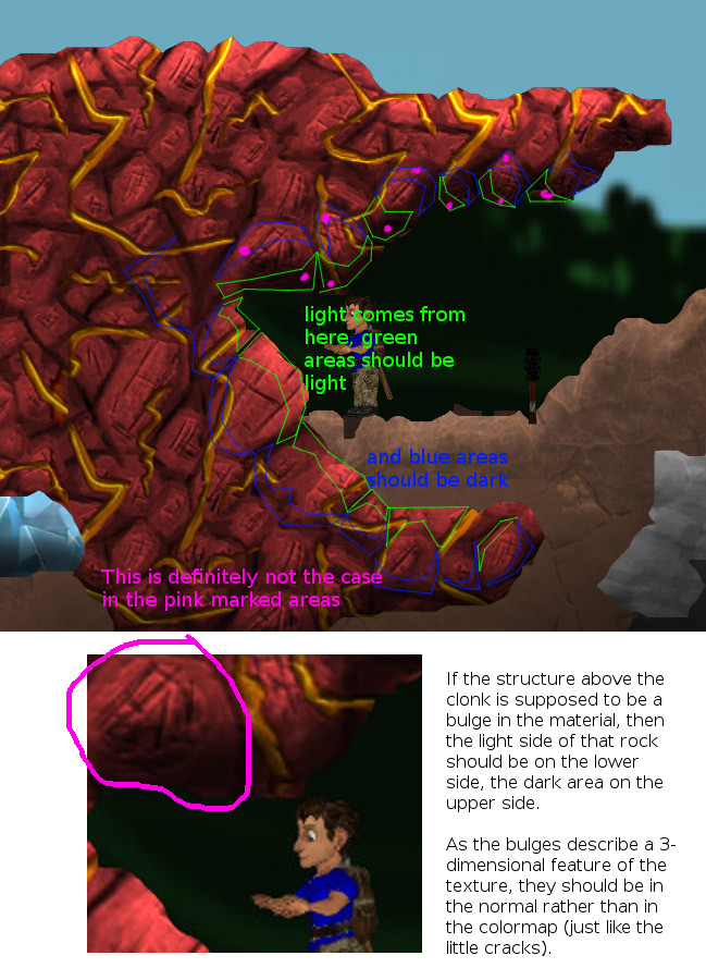
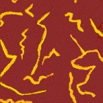
* The firestone material color map has some dark, almost black cracks. This shouldn't go into the colormap, it is the same problem as with many of the current/old textures. The normal map (thus) turns out to be quite flat, only 3d-ing the minor features, but not so much the big bulges. Perhaps you remember the spongy sulphur texture - its main problem was that it ranged from neon yellow to black.
* textures should be powers of two 256x256 or 512x512 (better). The firestone texture is 200x200 currently, the gold texture is 225x225 really, granite 400x400
* normal map textures should be the same size as their colormaps
* By the way, my compliments on the gold texture!
* Also, nice easter egg in the ice texture :-)
* I think the tunnel background color needs more structure, meaning as in the current one big bulges/structures in the normal map. Reason: You see the cool dynamic light effects mostly on the tunnel texture. If the tunnel texture is flat, then much of the ligth effect is lost. That would be very sad.
>Yes, but for some structure the light DOES come from a direction.
I don't understand that statement. The light always comes from some direction, but the color map of the texture may not assume it comes from a specific one. That is what the normal map is for.
> * The firestone material color map has some dark, almost black cracks. This shouldn't go into the colormap, it is the same problem as with many of the current/old textures.
If a crack is very deep, then even the side that faces the light direction will be dark because it's shadowed. I'm not sure if a normal map can actually capture this. Also, the effect of material normals is a parameter we can tune in the shader. So maybe the textures are fine and we just need to work on the landscape shader.
> If a crack is very deep, then even the side that faces the light direction will be dark because it's shadowed. I'm not sure if a normal map can actually capture this.
True, it can't. However, this is was I was trying to say with bringing up the sulphur texture as an example: If you have a material which contains black areas, this material can become difficult to recognize when it occurs in small spots (e.g. whats left after digging into it) since those spots may be (mostly) just black.
>* textures should be powers of two 256x256 or 512x512 (better). The firestone texture is 200x200 currently, the gold texture is 225x225 really, granite 400x400
Yes, I know. The reason for different values is the scaling, which cannot achieved otherwise(?)
>By the way, my compliments on the gold texture!
Credits to win93! I just modified contrast and color.
> You see the cool dynamic light effects mostly on the tunnel texture. If the tunnel texture is flat, then much of the ligth effect is lost. That would be very sad.
Ah, I completly forget this!
I'll give the normal/color thingy a try.
>Yes, I know. The reason for different values is the scaling, which cannot achieved otherwise(?)
Hmm I see, you want to adjust the size of textures ingame after you saw then ingame, I understand. Well then perhaps paint the textures with a much higher resolution first before making it tileable, then test them ingame to determine the best scaling, keep the original non-scalable source in higher res (to resources repository) and create the tileable scaled version only as a final result (to normal repository)
To my knowledge however, the textures are always stored in powers of two in the GPU memory. So if a texture is not in that format, the next higher size is reserved. So I guess what should be avoided are sizes just above powers of two. Also, the normal maps should be the same size as the color maps.

Otherwise you need me to show examples :|

In other words, with a correct normal map+color map, you would have a color map with variation in lightness of the texture only where it is pigmented darker. Neither the spaces in between the bulges nor the little cracks would be darker in the color map (except if you inteded those cracks to be not actually cracks but stripes of black dirt)
The normal map describes features that are not visible in the color map. This is currently not the case, as I initially mentioned. Just by looking at the current color map, you can guess its 3-dimensional layout.
Edit: To make it even clearer what I mean. This is about how the color map of a texture with a normal map would look like, more or less (just a mockup). The information about the bumps and the cracks is in the normal map.
I'd say that technique would be similar to "washing". Modern video games will probably have "self-shadow" maps or something.
Powered by mwForum 2.29.7 © 1999-2015 Markus Wichitill


![Germany [de]](/mwf/flags/de.png)
![United States [us]](/mwf/flags/us.png)

![United Kingdom [gb]](/mwf/flags/gb.png)

