Not logged inOpenClonk Forum
Up Topic Development / Art Workshop / [Request] Graphics for Control Methods
- - Date 2010-02-04 21:58
Parent - - By Newton [de] Date 2010-02-04 18:35
Also, I need a few rendered images as icons for the control-chooser. As Icons, so keep it simple and clear. For:

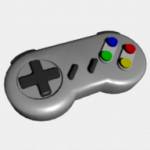
+ simple (SNES like) gamepad without analog-stick
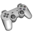
+ iconic PS2/Dual Shock gamepad with 2 analog-sticks
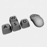
+ keyboard (mainly WASD) + mouse
Parent - By AlteredARMOR [ua] Date 2010-02-04 18:58
You should probably move this request to the Art Workshop section
Reply
Parent - - By Ringwaul [ca] Date 2010-02-04 20:11
I would like to work on this, if no one else objects.
Reply
Parent - - By AlteredARMOR [ua] Date 2010-02-04 20:23
I could if I had my computer back :-) but off you go
Reply
Parent - By Ringwaul [ca] Date 2010-02-04 21:58
I was going to make the two controllers first, because I have both SNES and dualshock controllers for reference.
Reply
Parent - - By Ringwaul [ca] Date 2010-02-06 06:27
Ok, I've finished a keyboard and mouse template. I'd like to know what to change to finish it.

Also, I'm working on the dual-shock controller, and I'm about half done.

I hereby license the following file(s) under the CC-by license
Reply
Parent - By AlteredARMOR [ua] Date 2010-02-06 07:27
It's a pity that small details (like keys on a keyboard) will not be very distinguishable since this image is going to be shrinked
What about image proportions? Shouldn't they be 1:1? (I know it can be changed later but, again, if you shrink it horizontally it wouldn't look as nice as it is now)
Reply
Parent - - By Newton [de] Date 2010-02-06 16:00
Hm. Remember it should be an icon - for keys+mouse. What you did now was rendering a picture of a keyboard and a mouse. An icon just has to convey the player the meaning connected with the symbol. So e.g. four keyboard-keys (WASD) and a mouse would be enough to depict this meaning.
Parent - - By Ringwaul [ca] Date 2010-02-06 23:32
Is this about right?

I hereby license the following file(s) under the CC-by license
Reply
Parent - By Asmageddon [pl] Date 2010-02-10 22:26
Hmm, looks a bit strange, but I think it would do the job.
Reply
Parent - - By Newton [de] Date 2010-02-10 22:54
More like this: Don't pretend the two things are lying next to each other - they are just displayed together. Also, last time I checked both mice and keyboards where white :P
Parent - By Ringwaul [ca] Date 2010-02-10 23:31

>last time I checked both mice and keyboards were white :P


Both my keyboard and mouse are black, so it's makes an annoying contrast when trying to colour something properly. :(
Reply
Parent - - By Caesar [de] Date 2010-02-06 10:31 Edited 2010-02-06 10:36
I just wanted to test my Cinema skills a bit. (Sorry Ringwaul, that I didn't notify you.)
Parent - - By B_E [de] Date 2010-02-06 10:46
The propotzions seem slightly odd, I would have the handles longer and the 2 analog sticks bigger, especially the sticks seem small in comparison to the buttons, which seem to be too big for the whole controller.
Parent - - By Caesar [de] Date 2010-02-06 13:46
Better now?
Parent - - By B_E [de] Date 2010-02-06 14:36
Jup much better, although I don't know about the color now, I liked the neutral "Mouse/Keyboardwhite" ;)
Parent - - By AlteredARMOR [ua] Date 2010-02-06 15:03
I once saw a dual-shock that had exactly the same color that the one in a picture. Though personally I think that is theese (I mean both dual-sjock and keyboard-mouse) are going to be used as icons they probably have to have bright colorfull look (don't know, the red/blue/green/yellow buttons might fo the thing).
Reply
Parent - - By Asmageddon [pl] Date 2010-02-06 15:54
As for gamepad - it looks very good in neutral white-gray noise. Keyboard could have sam color, but with used buttons highlithed in red/green/blue/yellow/whatever colour.
Reply
Parent - By AlteredARMOR [ua] Date 2010-02-06 16:16
Again I think an icon should be somewhat brighter (with more then just greyscale colors)
Look here for reference
Reply
Parent - By Caesar [de] Date 2010-02-06 15:41
Mh. :/ Absinth green looks nice, too, btw.
Parent - By Maddin Date 2010-02-06 17:05
I would add a grainy shader to it.
Parent - - By Newton [de] Date 2010-02-06 18:59
You should have first talked to Ringwaul. Now perhaps he already made a controller. Talk to Ringwaul if your controller fits to his graphics style.
Parent - By Ringwaul [ca] Date 2010-02-06 21:19
That's fine; I had forgotten the .blend on my school's computer for the controller I was working on. It wouldn't be finished until the end of Monday, then. However, I might as well start on the SNES-form controller.

>if your controller fits to his graphics style


Hmm, I think the only difference between caesar's PS2 controller and my PS2 controller was that the Directional-Pad buttons were not connected.
Reply
Parent - - By Ringwaul [ca] Date 2010-02-10 22:24
Well, here's my take at the dual-shock.

I hereby license the following file(s) under the CC-by license
Reply
Parent - - By Newton [de] Date 2010-02-10 23:03 Edited 2010-02-10 23:14
Perfect. Just adjust the colors (both the black and the white one is very common). Different perspective perhaps? Nobody will note these colored buttons by the way. (Also, the SNES controller needs some work imo, at least making it white instead of grey)

By the way: http://www.iconarchive.com/show/gaming-icons-by-deleket/Nintendo-SNES-icon.html

I can't say anything about how big the icons should look like or how they should be aligned. No idea what Sven plans for the player control dialog. For starters, you can't go wrong with 128x128 w/ alpha for course. Don't forget to commit those three models into the resources repository in case they have to be re-rendered.
Parent - - By Ringwaul [ca] Date 2010-02-12 04:53
I changed the dualshock's materials a bit, and made the snes a bit whiter.

I hereby license the following file(s) under the CC-by license
Reply
Parent - - By AlteredARMOR [ua] Date 2010-02-12 11:59
Don't you think there is a big color contrast on both mouse and SNES (less for dual-shock): the bottom looks slightly brighter than the top (which is even weirder when thinking about the light comming from below)? Maybe you should normalize colors (lighting) a bit.
Aside from the issue mentioned above, I like them very much
P.S. And yes, white SNES controller looks much better than the gray one
Reply
Parent - - By Sven2 [de] Date 2010-02-12 12:03
I prefer high contrast images. They are symbols after all; they're not meant to "blend" with a landscape.
Parent - By AlteredARMOR [ua] Date 2010-02-12 12:06
Well, I do not insist on this. I'm even not sure if I'm right about what I've told (just thought of weird bottom light). Probably better leave them as they are.
Reply
Parent - By Newton [de] Date 2010-02-12 13:22
I agree with AlteredARMOR here, the materials are a litle bit too shiny. But I also agree with Sven2 that it should have (more) contrast.
Also, the letters on the keys look a bit odd. Look at the WASD here: http://www.terminally-incoherent.com/blog/wp-content/uploads/2007/09/wasd_vs_arrows.jpg - try adapting the size of the letters, the (whiter) color and the slightly messy placement of the keys.
Parent - - By Caesar [de] Date 2010-02-11 14:56
You're a much better modeller. (What I expected.) And I can't copy the world.
Parent - By Ringwaul [ca] Date 2010-02-11 17:16
I used a reference image and traced(not really cheating in 3D modelling I suppose), so don't cut yourself short. :/
Reply
Parent - - By Ringwaul [ca] Date 2010-02-06 23:12
I hereby license the following file(s) under the CC-by license
Reply
Parent - - By AlteredARMOR [ua] Date 2010-02-06 23:42
Nice. And pretty "icon-like", though I suggest to shrink it a bit (horizontally) and orient that way:
                   ________
      ______/          O    \
    /                   O      O  |
   /      \ /              O      /
   |      / \         ______/
    \________/
     
Reply
Parent - - By Ringwaul [ca] Date 2010-02-07 00:46
Hmm. Any point to the opposite viewing angle? :p

I hereby license the following file(s) under the CC-by license
Reply
Parent - - By AlteredARMOR [ua] Date 2010-02-07 10:51 Edited 2010-02-12 12:04
Well I could cite the whole issue about why he objects should be oriented this way. But I will probably have a lot of problems with the translation. So briefly:

Emotions matrix


Anyone can easily show where up and down are:

      /\     
      |    UP
      |
      |

      | 
      |
      |   DOWN
      \/   

Almost everyone will agree that forward direction is to the right and backward direction is to the left:

                                FORWARD
/__________       _____________\
\                                         /
BACKWARD

So now we merge this four directions and show vector sums as well so we have eight directions as a result:

                                          UP
                            __           /\           __
                            | \            |            / |
                                  \        |        /
                                      \    |    /
                   /__________       ___________\  FORWARD
BACKWARD  \                                               /
                                      /    |    \
                                  /        |        \
                          \ /__          |        __\ /
                                           \/
                                      DOWN  

From this scheme it is obvious that sum of forward and up vectors is the direction to the upper-right corner. It 2-dimensional space it is the most "positive" direction. Opposite side (lower-left)  if the "negative" direction respectively.  Yearning towards upper-left corner can be considered as moving upward but "wrong way", and towards lower-right - as moving "straight into abyss". The centered object is considered as "calm, patient one" - it maintains the symmetry of the whole composition.

So here we go:

                                       |                 |
                                       |       UP      |
                       __            |        /\       |             __   +
                       | \             |        |        |              / |
                             \         |        |        |         /
                                 \     |        |        |    /
         _______________|_________|________________
                                       |                  |
              /__________    |    STASIS   |     ___________\  FORWARD
BACK     \                        |                  |                           /
           ______________|_________|________________
                                       |                  |
                                 /     |        |         |    \
                            /          |        |         |         \
                      \ /__          |        |         |          __\ /
                     --                |        \/        |
                                       |    DOWN     | 
                                       |                  |

It is very widely used in marketing (look for examples of Boeing logo, BP logo (look where the letters are) and others)
Do not use it for any case (there are a lot of exceptions).

Well, I think I've made my position pretty clear :-)

P.S. Oh, and move this to the "off topic" board, plese
Reply
Parent - By Sven2 [de] Date 2010-02-07 11:09
Still, if the gamepad is shown together with other icons (other control methods, etc.), it might look better if things are mixed up a bit. I.e., not everything points in the same direction.
Up Topic Development / Art Workshop / [Request] Graphics for Control Methods

Powered by mwForum 2.29.7 © 1999-2015 Markus Wichitill