
![[th]](/mwf/flags/th.png "Thailand")
 Hi there, as announced I will create a new navigation header for the website.
This and the formation of an organized art team is a good opportunity to make the logo and background nicer as well. The current logo was created by me a few years ago and looks a bit outdated now, with this wooden plank texture it looks a bit too agitated for a header, in my opinion. For the lack of proper artistry I very much oriented myself on the Battle for Wesnoth layout (logo+texture from the game) back then.
The new header doesn't need to be anything fancy, perhaps some (blurred?) screenshot from the game as a background? But also a very simply header can look quite good (see e.g. Wordpress: grey on black). It just should look better than the current one.

>The new header doesn't need to be anything fancy, perhaps some (blurred?) screenshot from the game as a background?
That's a not the best idea, considering we try to overhaul the game style completely :-)
Is it possible to make the new header a bit higher than the actual one?
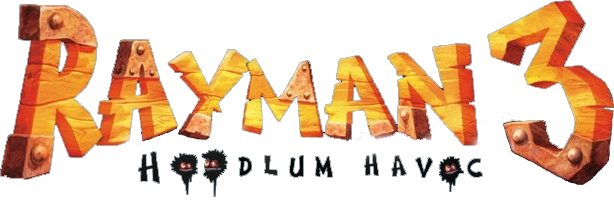
 Oh, oh, I have an idea for a logo!
Wooden letters with some iron stuff here and there, like the Ramyan 3 logo:
Here's some bad drawing once I made:

Maybe at the same time artist could also have a look at the game icon again, I never really understood how we can identify shield and a musket with OpenClonk. It should have a clonk!
![[de]](/mwf/flags/de.png "Germany")
 It looks pretty cool and icony, though ;)
I experimented with the Gameplay-in-Header-Idea.
It looks pretty cool and icony, though ;)
I experimented with the Gameplay-in-Header-Idea. Also my mobile Devices don't like the current submenus at all. Is there anything to fix this? :/
The thing I like about using screenshots as material for the header is that we can get some color in it. The downside is that it can easily divert the attention away from the website, so one has to be careful about how much of an actual screenshot one would like to put into it. For now, I think we shouldn't go with a screenshot because stuff is changing quickly (to the more beautiful).
 Just brainstorming with Nachtfalter.
Here are the uncommented sketching results:
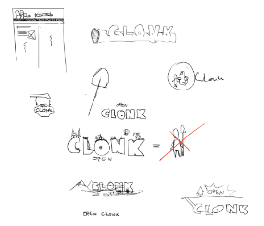
Attachment: Brainstorm.png - Brainstorming (64k)
Ok, now some comments about that:- We thought it would be nice to have a Clonk appear in the header. Eg. three clonks with shovel, hammer, axe. But We woudn't know how to create that as I can only draw "my" version of the clonks and we dont't know how to get the clonk model and pose it...
- We could have any material and build the title from that (like wood as shown up/right)
- could have title placed in landscape or landscape placed on title
- title digged into the ground?
all in all we should probably have the "open" and the "clonk" part of the title in different sizes. Otherwise its just super long and not very exciting.
could be like in the middle. There is the question if we are clonk and its the open version or are we openclonk?
>we dont't know how to get the clonk model and pose it...
just clone the ressource repository and you can find it here: /models/Livings/clonk
Could you sent it to me? I dont want to have Tortoise and all on my system just for the models. Also I'm on a mac...
ClonkOpenRevolution.blend is the main file.
Attachment: clonk.zip (7540k)
 You don't need to clone the repository to get single files (and of course you don't need tortoise to clone a git repository because git is sufficient).
Anyway, go to Development -> Repository or Resource Repository and on the bar with the red links click on 'tree'. That will show you the contents of the repository to click around. To download a file click on 'raw'.
Seriously? CrazyClonk is the normal Clonk and the file with just Clonk is that dreaded female Clonk?!?
The file I previously mentioned contains all skins and other stuff, just check the other layers.
 Why dreaded?
wtf, how can I get my blender-UI get back to a layout that looks remotely like the normal one after opening one of these files?
Why dreaded?
wtf, how can I get my blender-UI get back to a layout that looks remotely like the normal one after opening one of these files?
We are definitely OpenClonk, just displaying clonk in the header would probably be an infringement on Clonk's copyrights/trademarks.
I like the idea where you have this small settlement build on the letters forming OpenClonk, maybe you can just reduce the letters to OC (or make the other smaller)
I like the idea where you have this small settlement build on the letters forming OpenClonk, maybe you can just reduce the letters to OC (or make the other smaller)
Nice ideas. The screenshot thing of course has the problem that the artwork is changing, especially these days. The cool thing about the "digged in the ground" idea is that it requires not much artwork. Someone could just open up clonk and get creative. Also, the ground textures will probably not change for now.
Here some game logos which look quite cool imo. Maybe it's an inspiration for more!(the Dustforce Logo style can be quite cool with shovel and hammer, like the OC Icon)

 Tss. We have to show our players that we are computer savvy people:
(I had to use photoshop 3D filters instead of WordArt, because I couldn't find a copy of Word97 anymore :()
I hereby license the file OPENCLONK.BMP.BMP-1.GIF under the CC-BY license
Attachment: OPENCLONK.BMP.BMP - OPENCL~1.BMP (166k)
")
![[at]](/mwf/flags/at.png "Austria")
 I think we still have a copy of Word97 lying around. Do you want me to send you the folder with the 33 diskettes?
 Apart from the logo, which is OK for now in my opinion, something has to be done about the background of the header. Especially now since I scaled it up, it looks quite bad (just scaled up the background image as well). The current header bg is not good because there are details in there that don't belong there like the irregularities in the wood texture.
This is how the new header looks now.
I am aiming to replace the old header sometime this week, but of course not how it looks now.
![[ua]](/mwf/flags/ua.png "Ukraine")
 Not sure that this is the ideal solution for header but it definitely looks better than the current version. So this is a step forward.
It is not an experiment. This header can now be considered final until a better background (+ logo) is found.
Not sure that this is the ideal solution for header but it definitely looks better than the current version. So this is a step forward.
It is not an experiment. This header can now be considered final until a better background (+ logo) is found.The new header came with a few technical and usability changes to it. Since there was no activity in this thread for one and a half weeks and there is no deadline on that whatsoever (how can there?), I felt these changes should not be delayed any longer.
Again, I primarily need a fitting background, a simple one that does not divert from the content is enough. The logo doesn't have to be redesigned for this, after all it is the one we have ingame as well and nobody complained.
I think the background could be a job for Matthi. The people say he's really good at painting stuff!
 Well, "really good" is not what I'd say myself, but if you have some idea of what I should paint, I'd give it a shot :)
We should make a brainstorm session soon! Feel free to contact me :)
Well, "really good" is not what I'd say myself, but if you have some idea of what I should paint, I'd give it a shot :)
We should make a brainstorm session soon! Feel free to contact me :)
![[py]](/mwf/flags/py.png "Paraguay")
 This is a completely random idea: We could have the words OPEN CLONK on the side of a rusted sub hull?
Not yet, no. So far, I haven't got any ideas of what could go into that small space. I could of course do some wood texture like we had before, something like this:
This is a completely random idea: We could have the words OPEN CLONK on the side of a rusted sub hull?
Not yet, no. So far, I haven't got any ideas of what could go into that small space. I could of course do some wood texture like we had before, something like this: There was a landscape in Fungiforms sketches.. sth like this could work? I couldn't find the OC Logo in a common format in the repos, though.
 Wow!! That is great! Is this but a sketch or can I just put this online like this? I think it is no problem that it looks a bit lifeless right now (no trees, no other buildings than the windmill, nothing going on), after all it is just a header that should not divert too much attention from the main site.
Also, what is definitely good on that one is that you have a uniform color composition, so it already doesn't stick out too much from the colors used.
Why do you need the OC logo? The logo is a PNG on top of the background that is clickable and leads to the home page. It is here. Edit: Or here if you mean exactly the one from the website but with transparency.
It would be great though if this were loopable on the width so it works with any screen resolution (and doesn't necessarily have to be that long).
I only wanted to put the logo on top myself, to see how it works together.Basically you can already put this up, if there a no objections. If most of you like it, I will try to get some more work done on it (try to make it loopable, detailing stuff, adding a few trees or other things maybe.)
Edit: Have a look at my galleries (one, two) to get a feeling for how a more or less "finished" painting could look :V
Powered by mwForum 2.29.7 © 1999-2015 Markus Wichitill
