
Also in my local build the scrollwheel does not work when not in editor mode, it seems to "loose focus" after one tick of scrolling... makes the controls branch pretty much unplayable.
![[de]](/mwf/flags/de.png "Germany")
 That is extremely weird as the change shouldn't have changed anything regarding component consumptions :o - needs investigating!
>- Make the Clonk icons (top of screen) use the new gui system.
I can probably do this one, but first I will do it for the goal and wealth HUD elements, because these are easier exercises :)
Another bug: Can't put any materials into construction sites, they are not covered by the interaction menu yet.
>I can probably do this one, but first I will do it for the goal and wealth HUD elements, because these are easier exercises :)
ok :)
The real reason why I didn't do that one (the Clonk icons) was that I also wanted to clean up the HUD interface at the same time. I think it's full of stuff that is now unused
I don't see a workaround for this, any ideas Zapper?
mhhh. I guess that'd need engine support. Ooor, why do we have the engine ranks? Is there a reason why we are not using a script implementation?
 I don't know if it's relevant, but I once wanted to make the barrel in the inventory to show the current amount of water pixels stored in it. I somehow couldn't do it. So I guess it would be cool to be able to show additional text on items shown in the GUI. Be it fill amount of a barrel or some timer or any other status of an object.
>- Make the Clonk icons (top of screen) use the new gui system.
This has been implemented!
>- Possibly add an old-school HP bar at the left of the screen?!
Please not, we can think about making the HP bars more visible or do alerts with sounds, to make people aware of low HP. But I'd like to keep the HUD elements to a minimal.
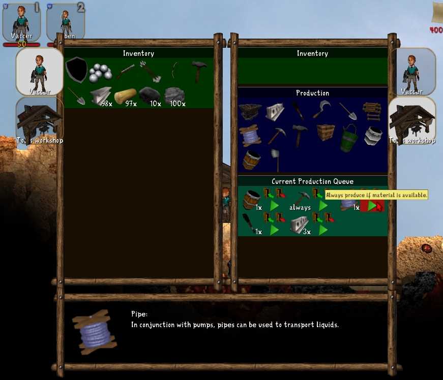
Food for thoughts:Should the Current Production Queue of the producers be exposed to the player? It would randomly change order (when an item is finished/started) and thus not really make for good UI design.
The necessary information and buttons (amount, [remove], [endless production]) could just be put into the Production section above as well.
PS: ignore that I am lacking icons for the buttons :)
 I prefer just having the extra labels in the production list. But those should be prominently visible. Just showing "1x" at the bottom of the icon might not be enough. E.g., items currently in the queue could get a highlighted background. The highlighted background could change color between red and green depending on whether sufficient materials are available.
If you really like the queue and want to offer it as means to reorder priorities, it could be a collapsed header by default which you can uncollapse by clicking on it (and then stays uncollapsed for that player for all buildings stored e.g.as a player info variable). But I do not think it is needed.
 If the construction is complete instantly, what for are production queues?
Even though I think the menu is very nicely designed, it looks cluttered because there are so many windows with each a prominent border and this dark half-transparent background. Would it be possible to show the dialog with just one window border around it and use some other less obstrusive UI design to separate between the left and the right inventory/production?
If the construction is complete instantly, what for are production queues?
Even though I think the menu is very nicely designed, it looks cluttered because there are so many windows with each a prominent border and this dark half-transparent background. Would it be possible to show the dialog with just one window border around it and use some other less obstrusive UI design to separate between the left and the right inventory/production?Also, regarding the general UI design... I think it might look clearer with a white (pergamentish) non-transparent background and black text. Perhaps without a window decoration at all (bit like in the main menu). To increase the focus on the menu while it is open, perhaps it'd be possible to add a black 90% transparency above the whole screen (but behind the menu of course) while it is open?
>add a black 90% transparency above the whole screen (but behind the menu of course) while it is open
I want to see what's going on in the game, even when I have the menu open.
But I too like the idea with pergament paper.
@Zapper
kinda related: At the moment the menu fills 90% of the screen. On small resolutions like in the screenshots this looks good, but on big screens it doesn't. Could it be possible to make the menus not bigger as they are in the screenshot above, even if the overall viewport is bigger?
And yea, the production queue stuff should be in the "Production" window.
>kinda related: At the moment the menu fills 90% of the screen. On small resolutions like in the screenshots this looks good, but on big screens it doesn't. Could it be possible to make the menus not bigger as they are in the screenshot above, even if the overall viewport is bigger?
Yeah, that's basically the to-do point "I can imagine that a fullscreen menu with a huge screen usually looks pretty stupid, while on a small screen it should cover everything -> make available to user and give sensible defaults." from the starting post.
I am not 100% sure how that will be solved in the end, but I am thinking about offering the user a selection (full screen / half screen / ..) in the options and setting a sensible default based on the resolution. Oooor another possibility would be to restrict the menu to always X size (f.e. maximum of 30 centimeters width).
>Would it be possible to show the dialog with just one window border around it and use some other less obstrusive UI design to separate between the left and the right inventory/production?
Yes, of course!
>Also, regarding the general UI design... I think it might look clearer with a white (pergamentish) non-transparent background and black text
The only reason why it looks the way it does, is that the darkish-woodish design was the only menu/dialog design we had. I am happy about any suggestions, especially when someone also wants to draw it. I am not sure wether the menu decoration currently supports a tiled image as the background, though. (Sven?)
>To increase the focus on the menu while it is open, perhaps it'd be possible to add a black 90% transparency above the whole screen (but behind the menu of course) while it is open?
It would be possible, but that would probably also cover the other GUI elements (inventory, money, Clonk portraits) then. Do we want that?
FYI: the flag is no longer static back but instead just has a FLOAT action. (in the controls branch)IMO we should use the categories properly so that we can rely on things actually belonging into a category (structure/vehicles) at all times.
I actually changed that shortly after changing the flag's category :)
FYI: items in the Controls branch should use the RejectUse callback to check usage conditions which only delay the usage. The usage (ControlUseStart) will be executed as soon as RejectUse returns false if the player is still holding the button down.f.e.
func RejectUse(object clonk)
{
    return !clonk->HasHandAction();
}

func ControlUseStart(object clonk)
{
    // we can rely on the Clonk being ready!
    Explode(1000);
}
>- Possibly add an old-school HP bar at the left of the screen?!
opinions?
I also prefer the current bar to the CR bars. Imo the CR bar is getting a bit large on today's screens. I also remember people used to not realize that the big bar to the left was a health bar, but I haven't heard that complaint about OC yet.
The screen size is a very good argument. Not only would the bar be huuge most of the time, but it also is at the very left of the screen, out of your field of vision. Convinced.What about a small horizontal bar beneath or above the inventory though? :)
>it also is at the very left of the screen, out of your field of vision
Hmm? Isn't that the case already? It's in the very upper left corner atm.
Also a CR style could just cap the zize at some point?
The bar could also be horizontally in the middle over the inventory like in minecraft.
 That might mitigate it, but wouldn't really tackle the problem. It would not help to communicate the ressource "health" in a way that is really easy to see and quick to read.
>- Possibly remove throw-on-leftclick and make left-click only Use the item (or do nothing) and rightclick always throw the item?
Comments?
Left click would always use the item (never throw it) and right click would always throw the item. That would imply that you could not throw flints with left-click, of course. That would also mean that players aren't confused about which item can be used and which not - which I still am, for example: I constantly forget that you cannot build metal bridges from metal like in CR and throw my metal away.
It would enable simple trial & error about what can be used and what not.
Indeed, it makes sense to separate the two.If the right mouse button is still free, of course it could be used. I thought the right mouse button already had a task. Otherwise I would suggest shift+LMB
Experimental: when you (throw-)click your Clonk or below your Clonk, you drop instead of throwing.Current situation:
When you throw straight downwards, you hit yourself and tumble.
When you click very close to your Clonk, you don't have a fine grained control of the throw direction anyway (where exactly was the center??).
Now you will just drop in both these situations. Let's try it and see how it feels.
What about standing at the edge of a cliff and throwing a flint downwards?
You only drop when you click in a rectangle below your Clonk (not in a certain angle). So I guess in that situation you would click far enough away to be out of the rectangle AND not straight down anyway.I just caught the cases where you would actually hurt yourself when throwing. So even in the current state you wouldn't be able to throw a flint down the cliff in that angle :)
Powered by mwForum 2.29.7 © 1999-2015 Markus Wichitill
